Brands of the World is the largest free library of downloadable vector logos, and a logo critique community. Search and download vector logos in AI, EPS, PDF, SVG, and CDR formats. If you have a logo that is not yet present in the library, we urge you to upload it. Thank you for your participation.
Version history
Version 1

- I
- S
- T
- C


12 Comments
I like it overally, but I don't understand the idea.
Acredito que você seja brasileiro, então vou escrever em português e depois em inglês para meus colegas da comunidade entenderem.
Renato, gostei muito de sua ideia e transposição das formas para simbolizar o nome do escritório. A tipografia está sóbria e perfeita. Tenho minha dúvidas sobre a cor, mas é pessoal, Eu adicionaria uma cor primaria, talvez um azul, mas é pessoal OK. A cor cinza com o fundo em texturizado em papel reciclado ficou show.
Parabéns pelo trabalho!
I believe that you are brazilian, so I will write my point-of-view in portuguese and after 'I'll write in english to the community.
Renato, I really liked of your idea and forms transposition to symbolize the law office name. The typography is sober and perfect to the business.
I have some doubts about the colour. Maybe deduct a primary color, for example the blue, but this is personal ok? The gray with the textured background in recicled paper became great!
Congrats for the job!
Obrigado facio, Sou Brasileiro sim.
A opção por tons de cinza foi devido a limitações do cliente, minha primeira opção de cor também é azul e vou trabalhar essa cor no manual de identidade.
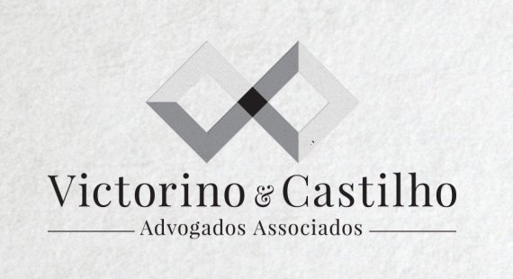
Quanto ao ícone, ele simboliza o relacionamento entre as duas sócias, mostrando que, juntas, são mais fortes (ponto preto no centro) e formando o símbolo do infinito para lembrar do relacionamento duradouro entre as sócias e delas com os seus clientes.
---------------------------------------
Thanks facio, yes I am Brazilian.
The choice for grayscale was due to limitations of the client, my first choice of color is also blue and this color will be present on the Brand Book.
As for the icon, it symbolizes the relationship between the two partners, showing that together they are stronger (the black spot in the center) and forming the infinity symbol to remember the enduring relationship between them and with their clients.
I like the typeface you have chosen, I think maybe it could stand to be more bold - maybe by all caps?
I didn't rate the colors because there are none, you should try it with colors. And please remove the background before you post, the logo will need to stand on its own first with a white or black background.
The symbol is okay, but I echo - I just don't know what it means or why it looks that way.
All that being said you are going in the right directions, push this idea and do many variations! Looking forward to seeing what you will come up with!
Isn't the symbol a 'V' and 'C'?
I think the ampersand is the problem here. I'm pretty sure it comes from a script font, so it doesn't match the main font used and is too curvy for the harsh lines of the symbol. I would go for a much simpler ampersand to help it disappear. The size you have made the ampersand is good, as it hides the fact it's not centered.
Have you tried any of the text in caps? I'm curious to see what that looks like.
Thanks for your comment Alexi,
Yes, my first options was in caps, but it didn't work well in my opinion. I really dont see a problem with the curvy font and the ampersand, I think that makes it balanced, because I need to show strength and confidence to be a brand for lawyers, but lightness to be a partnership between women.
Contrary to the above comments, I really like this logo. I'd love to see how it is applied to different medium and how the symbol will behave then.
I have no problem with the ampersand. I think that it compliment the main font pretty well. The symbol is pretty powerful if you ask me. For me, it represents an infinity sign, its squareness and sharp edges symbolizes professionalism and expertise.
Good job.
Thank's Shawali, you really got it.
The icon symbolizes the relationship between the two partners, showing that together they are stronger (the black spot in the center) and forming the infinity symbol to remember the enduring relationship between them and with their clients.
I'm posting the stationery mockup.
How you got that on the paper clips I'll never know. ;)
I really like the logo. I think is inspired and very fitting for a law group. Nice work.
These are usually PSD templates you can find on the web.
I got 'VC' straight away.
I do like it a lot.... I probably wouldn´t change it