Vidsome
Jesse Mogensen | Wed, 10/08/2014 - 12:20
Brief from client
Vidsome is a new online video marketing agency. Their main business is marketing via youtube, and some other video-platforms. And they're looking to expand their business by making videos themselves.
I got carte blanche for this one, as in "make it recognizable".
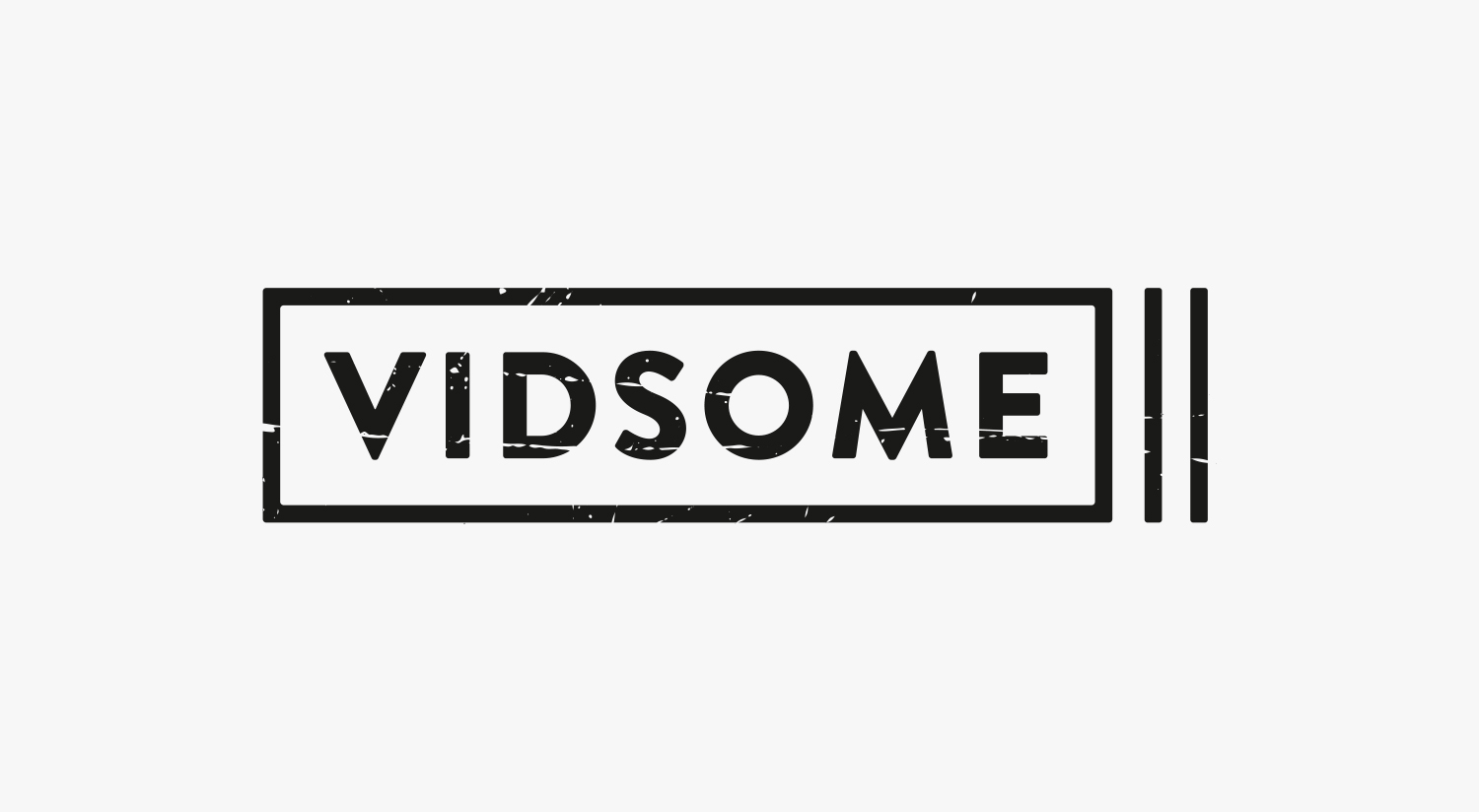
The logo resembles a very stylized camera. The scratches should only be used at larger sizes, so another version without 'grunge' is available. Also, the kerning isn't perfect yet.
Let me know what you think!
9 Comments
i like it! although i did not no what the two lines at the end were supposed to represent until reading you description
Thanks! Yes, I figured it shouldn't be too obvious.
There's really not a lot to say about this, since there is very little going on. In that case, the only thing left to comment about is the two lines. It's supposed to be a stylized camera, but even after reading the description I still don't see a camera in this logo. It honestly looks more like a cigarette.
The scratches detract from the clean look you're creating; I don't think I'd keep them in the larger version either.
Typography is fine. I never had a good eye for kerning, so if there are any kerning issues I don't see them.
Looks okay, but again I dont think I agree with the two lines. Besides that it looks a bit plain to me as a logo.
now that you have said it i also see the "cigarette"
Thx for the feedback!
Now that you say it, the logo indeed reminds me of a sigarette.
Don't agree with the plain part though. But thats my opinion.
I'll give it a revision.
I like this logo very much, from the font work to the distressed look, but I also see a cigarette or a pause symbol.
Good job nonetheless.
I agree with what most of the guys are saying. I do think its a clean and crisp logo and it should do its job. But it IS rather plain by todays standards but thats not necessarily a bad thing.
a cigarette (sign)?
Transform your space with immersive visuals that captivate and engage every audience. KL Multimedia’s interactive video walls offer dynamic displays that adapt to your content, creating unforgettable experiences. From corporate presentations to public exhibitions, these walls bring your ideas to life with clarity and brilliance. See more viisit here https://www.klmultimedia.com/Interactive-Video-Walls.html with KL Multimedia’s Interactive Video Walls – Visuals That Inspire, and discover how technology can elevate storytelling, spark creativity, and leave a lasting impression. Engage, inform, and inspire like never before.