Brands of the World is the largest free library of downloadable vector logos, and a logo critique community. Search and download vector logos in AI, EPS, PDF, SVG, and CDR formats. If you have a logo that is not yet present in the library, we urge you to upload it. Thank you for your participation.
Version history
Version 1

- I
- S
- T
- C


6 Comments
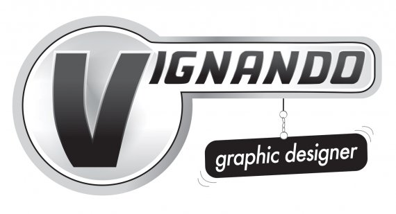
Idea: I'm not clear on what the idea is, Is the text supposed to symbolize speed? and the hanging "graphic designer" part supposed to be a sign? Why the cartoon-esque motion marks?
Symbol: What symbol? There's not a single mark in this logo.
Typography: You broke the cardinal rule of not distorting type! Not only did you distort the type, you didn't even do it consistently. The "V" is distorted Differently than the "ignando."
Colors: Bad. If it supposed to be a one color, get rid of the weird blueish grey behind the "V."
This doesn't make any sense, it doesn't look good, and it's not going to get you any design work.
I agree with Frank about not understanding the shape of the symbol, the hanging down sign part, the cartoon motion marks- what's it all MEAN, man!?
I also agree with Frank on the typography- although I don't know of any cardinal rule about NEVER distorting type- sometimes it's alright, but this instance isn't one of them. The type distortion looks really bad.
I'd start from scratch. I don't know where the hanging sign idea came from- but just sit down with a cold beer (or three) and a sketch pad- see what you come up with! (And remember- in the new versions, no gradients, no poorly distorted type, no motion marks, and if you're feeling wild, maybe add some color!?!?
Sorry. Restart all over.
Totally agree. I don't get this at all.
The idea is good, but lacks life and also has many effects. The plaque must be removed, does not match the rest.
Simple : no it's not. With all these strokes, gradient and altered fonts, it's way too complicated.
Practical : nope. The composition is a mess, especially with this useless dangler.
Objective : huh?