Brands of the World is the largest free library of downloadable vector logos, and a logo critique community. Search and download vector logos in AI, EPS, PDF, SVG, and CDR formats. If you have a logo that is not yet present in the library, we urge you to upload it. Thank you for your participation.
Version history
Version 1

- I
- S
- T
- C


5 Comments
color variation
This logo has potential but you're not quiet there yet.
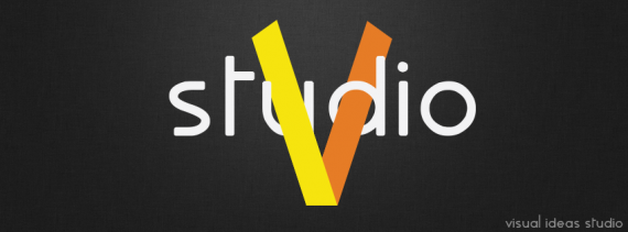
First and foremost, you need another font. This one looks weird and flimsy, especially the S and the T.
I like the symbol and what you did with it, but I think it hides the U too much, making the whole thing difficult to read. I would just make the left part of the ribbon pass behind the U.
Last thing: is it supposed to read "visual ideas studio"? Because I definitely read Studio V or Studio 5.
Keep it up!
thx for your critique and advices
PS yes, visual ideas studio - this ribbon is like V and I toghether :)
In that case this logo isn't working at all. I only see a V, not an I. No way anyone is gonna read Visual Ideas Studio.
I didnt like that the V covers the U, you can use the foot of the U to do the same effect but avoiding cover in that amount. In other words pass the "ribbon" down the curve of the U but above the foot. I say this cause isnt that clear when you have your logo in a smaller size.
Another thing i didnt like the T, i feel it disbalanced. If you focus on the S and T, that space isnt good :S