Webia
mattcamacho | Mon, 07/11/2016 - 20:12
Brief from client
The name of the business is Webia. It is a web design, marketing and community management company I'm trying to start with some friends.
We want to have a friendly-modern look, priorizing out creativity and flexibility in every work.
Things we do:
- Wesite Development
- Community Management
- Online Publicity
- Graphic Design
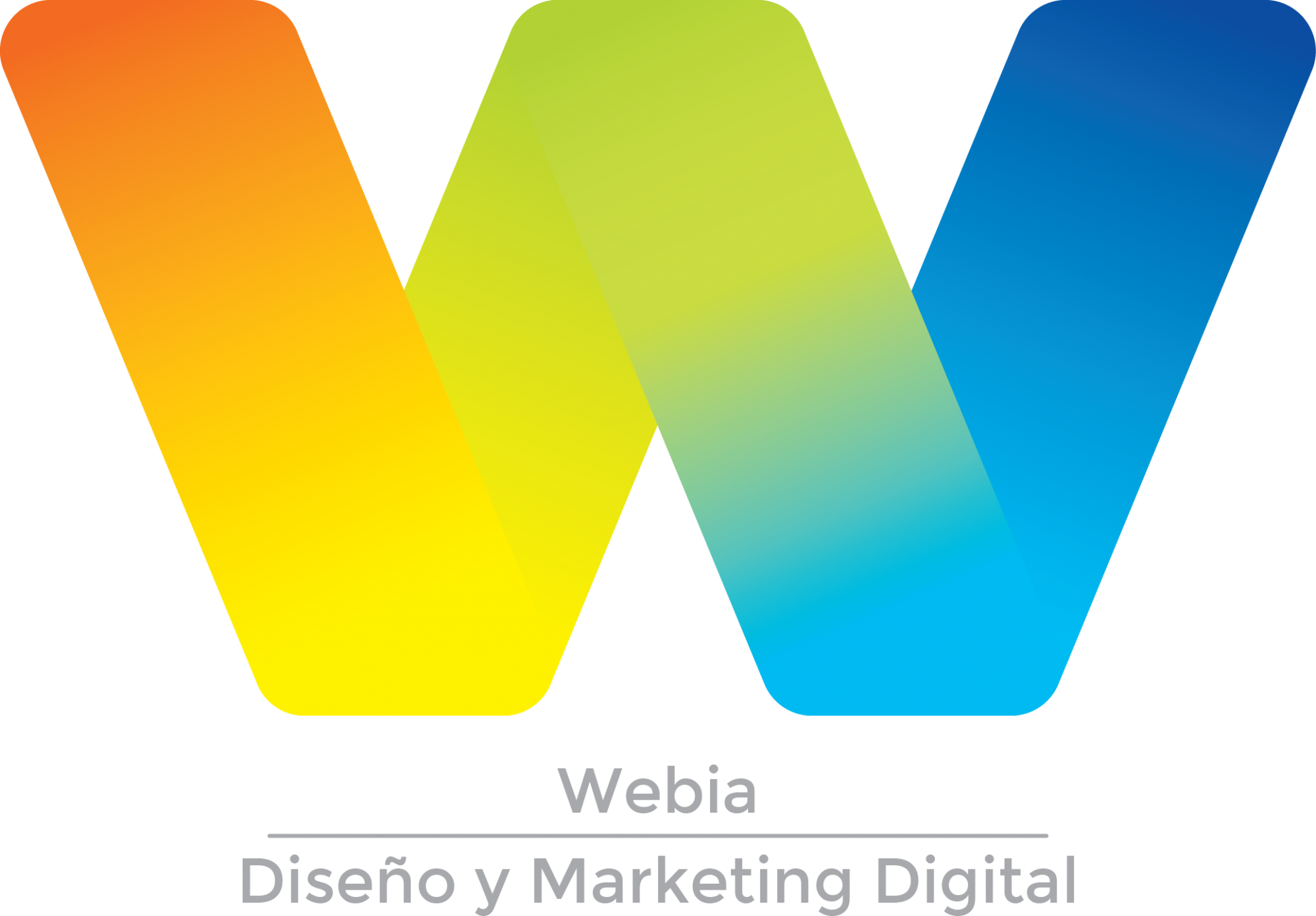
Made the logo a little bit brighter and fixed the gradient in the middle so it doesn't cut to two "V"s and reads as a single "W". I hope that makes it clearer.
Also added the word mark below in grey in order to keep it lightweight with the logo. I Chose a sans-serif font which I think was appropiate for the design (text is in spanish, it means "Web Marketing and Design").
24 Comments
this is so much better! not crazy about how close the text at the bottom is though or sure about that font.
I think that you have done a super job on this one!
There is , also, indication of " A " in a center part - nice reminder of Argentina, by the way.Wonder if you could try to lower each wing of " W " by a length of a curve at outer corners and see how it will look like? On a funny side I see that is a mirror image for : " Matador " Mario Kempes, Maradona and Messi - well done!
There's also an indication of two Vs on each side. I wonder what the OP is trying to say. VAV... What could it mean??!! It's so intriguing.
Is this what you ment? I don't dislike it but I don't know if I like it better either haha.
Don't bother. Our friend Félix tends to see darndest things in every logo. And I was just goofing off =)
Hahaha it's ok! I like that though, it makes me work in order to get a better result every time. I'm quite perfectionist too haha
It is not bad at all, nice one.
No that I look at it, I like this version better than the original =)
Charlie, it is better and wings of " W " when lowered are balancing the entire letter.
Good job, but I feel that the text does not fit well, I think you can do much better with that part.
Cesar, you're right on a font. I think a text could be done in a same manner as symbol design wise not colors, of course.
Text as a symbol might work, but I'm scared to take the looks away too much from the logo. I was thinking on using a simple font to keep it more simple maybe?
You're right, I'm not liking the font so far but I'm struggling a lot trying to find one that suits... I'll keep looking!
Thanks a lot!
Two problems here:
1) The brand name, Webia, should be more prominent than the subtext, "diseno and marketing digital". It's a matter of hierarchy of information. Also, try to use two different fonts that match each other well.
2) The symbol is really overpowering the word mark. Not that it's a bad thing. You can have several iterations of the logo, so it can be adapted to different medium and environment. But for the default iteration, find the right balance between the symbol and the wordmark.
Keep it up!
good comment. I think simply adjusting the spacing could solve most of this, maybe bump up the font size of Webia too a hair, at least.
Didn't noticed the hierarcy problem until you pointed it (funny I've been working on hierarcy at school recently, it just slipped hehe) but you're right.
I get what you say, I might need to size down the logo a little bit and make the word mark bigger. I was thinking on placing it to the right as it comes out of the logo maybe?
I'll work on this changes for my next upload. Things are getting more specific but I really like that!
Thanks a lot for your help and for keeping track of this work :)
Maybe even continue a word " Webia " straight from a right wing of a " W " - that way a subtext would go more prominently under. Just a thought...
Great ideia!
Thank you very much!
I'm trying to learn here, I feel the logo is not distinguish enough, as Shawali pointed out more iterations needed so "it can be adapted to different medium and environment." For example when you need to print a black & white logo on a packaging box, it's not a very unique W. Please enlighten me if you think otherwise. Thanks.
Thanks for your comment, I'm still trying to figure out the black and white logo. Been sketching a little bit but didn´t get to an end. I want to finish the main coloured logo first and then develop the B&W one.
Thanks!
I'm a fan of this one. The colors and shape are distinctive and easy to read at different sizes and on different backgrounds. I do agree with some other comments that the company name needs to be more prominent. As far as the single color version is concerned since this is a service company and not based on products packaging and such should be a lesser concern. Something that could be worked out with a cool halftone effect, but more fully developed than my quickie attachment.
I do agree with the other comments about the text part of the logo, but I'm still trying to find a suitable font for it. I've been searching, adjusting existing ones, and even trying to create one myself (this however was the most frustrating one haha). But I'm working on it!
On the other hand, the black and white logo is not developed yet, I'm trying to finish the original one and then I'll figure the B&N one out (is this procedure correct?). I like your idea, I'll try to experiment with it and upload any sketch soon!
Many thanks for the help, and I really appreciate your interenst in my logo!