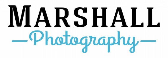
Wedding Photo Business Logo
robots4joey | Sat, 07/12/2014 - 22:58
Brief from client
Catholic wedding photographer, but also does families and kids
Clean, bright, simple, professional, modern- no graphics
would be cool if a cross could be incorporated somewhere- not critical at all.

I went pretty basic, hoping it looks professional for them.
They wanted something with a cross if possible, I have some options where the t in photography stands out more as a cross but I didn't like it as much. I had to use drop shadow or 3d effects, then it just stood out too much I thought.
What do you think? I really appreciate the comments/critiquies


8 Comments
After the other logo for a atheist website, now we have a catholic photographer. It's not a very smart idea, from a business perspective, to cut yourself off from all the other types of weddings, Jew, Muslim, protestants, agnostic, etc... But again, that's not what we are here to talk about =)
I like the idea of a simple text based logo, with two complimenting fonts. But for some reason, I don't like the serif font you picked. It doesn't really compliment this really nice cursive. The two strokes aren't really needed in this instance. But that's just me.
I'd keep looking for another font for "Marshall", maybe a sans serif.
Good luck!
Thanks for the advice so far! I'm trying to find a new font for the word Marshall... I'm having trouble finding something that compliments the photography font
what do you think of these options?
option 2
option 3
i agree with the above about the main font. From the options you posted earlier i would go with 2 or 3, but tweak more in order to obtain some cohesion between the fonts. For instance you got all caps and a caligraphic font so add something particular to the main font. This way you will get more personality and unity.
Hueroth is right, just don't type in your text and think you're done.
Font based logos are simple, but are in fact really difficult to do well. You need to do a lof tweaking, alter some characters to give them more personality, fine tuning the kerning, etc...
I'd go with option 1, but with a wider tracking and a good kerning.
Good luck.
Thanks for all the help! I'm new at this, so it's great to have feedback!
I adjusted the kerning a lot on the 'Marshall' and did alter some characters too, I also shrunk the 'photography;.
Any other advice? You all sure have been awesome help! thanks 1,000,000!
Looks a bit better, but the kerning need some more tweaking. Look at these neverending spaces on both side of the S! =) And betwwen the two L also.