Wellness Logo
walkie20 | Fri, 11/02/2012 - 17:03
Brief from client
Client requested a logo for a company that leases medical equipment. They specialize in cardiac machine rentals, so they want to promote their expertise in the market to executives looking to rent equipment and individuals in need of the machines.
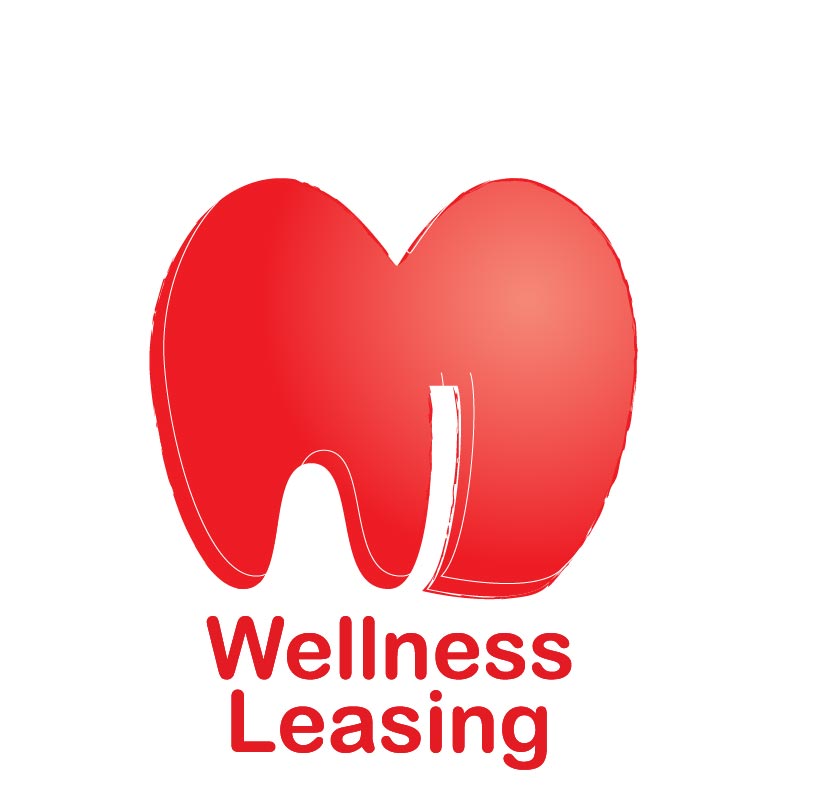
This logo was designed to subtly incorporate the imagery of an
apple, a heart, as well as the “WL” initials of the company. The logos are accompanied with the full name of the company, which may or may not be included in applications.
2 Comments
The symbol looks like a big red tooth, I would have no other idea for it. besides the symbol is not vector, it has crunchy curves. The font is not sharp either and it's a boring font type. The size of the symbol is not correct compared to the size of the company name.
Yeah, I have no idea what that symbol is about, nor do I understand why the edge is all messed with (it looks like a bad photoshop job or something?) and lastly, why is there a gradient in the symbol?
I also dislike the font- it's like arial rounded or something! Start over, way over. Get a symbol that's aesthetically pleasing but also says something about the company. (Or at very least something that's pleasing to the eyeballs!) Lose the gradient, lose weird edges, and pick a new font! Or heck, try a couple different fonts!
(Or if you're not a designer, maybe hire someone off of craigslist!?!?)