WEPPLA
Brief from client
WEPPLA is a nonprofit organization established in 1993 as a partner organization of the northamerican organization named Interexchange. WEPPLA represents the program "Camp USA" in Mexico and the letters stand for: “Work & Exchange Public Programs Latin America”.
WEPPLA offers you the possibility of having the greatest cultural and labour experience, by working in one of more than 500 summer camps all over the United States.
You can choose the type of camp you would like to work in, and also you can choose the job you want to do, it can be as a Counselor or as Support Staff.
For more info: www.weppla.com
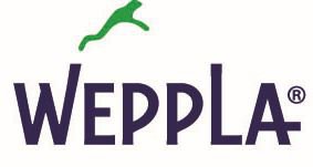
The logo was design by thinking in the interexange between countries. Students from Mexico are going to USA or Canada for a summer work.
They work in summer camps, they are between nature, working and having fun.
The use of the frog is because it's a very active and curious animal. He is always exploring and working. Also this specie (the green tree frog) can be found in the USA forests, where the camps usually are.
The typography was modiffied and the letters "W" & "L" are longer representing that the frog jumps from one to the other, just like the students, they "jump" from Mexico to USA or Canada.
5 Comments
Hello, i confuse the frogg with a diver man jumping over water
Nice idea and i love the text, you just need to make the frog look more frog like, it looks to much like a person atm
I think it works. I have no major problem with the symbol. Congrats =)
I loooooooooooooove thiiiiiiiiiiiiiis fooooooooooont!!! LOVE the font. The symbol is good too. G'job!
Nice typography. Work a little more on styling the frog so that it's more recognizable – not "literal," just understandable. I think that half of the challenge in recognizing the frog comes from its size relationship to the type. The other half is how it's drawn.