Brands of the World is the largest free library of downloadable vector logos, and a logo critique community. Search and download vector logos in AI, EPS, PDF, SVG, and CDR formats. If you have a logo that is not yet present in the library, we urge you to upload it. Thank you for your participation.
Version history
Version 1

- I
- S
- T
- C


5 Comments
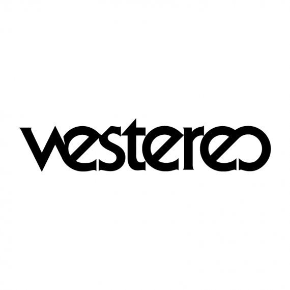
I read 'vestereo' which is obviously an issue. Like it overall though.
I agree it takes a while to read we stereo which is an issue, it looks cool overall i like the idea but its hard to read unless you know what its ment to say!
I like the overall look, but agree with what said about it being little difficult to read.
I read Westereo and I had a bit of a hard time to be sure it was an O at the and.
It looks cool visually, but I certainly do not read We Stereo.
NICE! Thank you very much for your first constructive feedbacks. I also thought about the problem with the ligature between W & E. But did you get the idea with the E & O at the end adapted from the original "Stereo" Sign?