wildcat radio
Daryu | Fri, 06/19/2015 - 03:49
Brief from client
this is the logo concept of mine for the radio station in my school
i want to have a critique in my logo so that i can improve... thanks
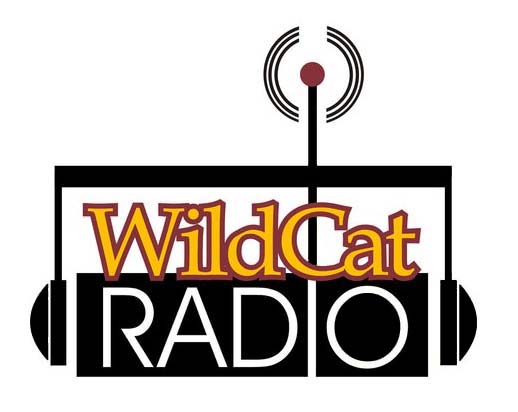
radio logo concept
this is the logo concept of mine for the radio station in my school
i want to have a critique in my logo so that i can improve... thanks
radio logo concept
6 Comments
On a professional level, this is a mess. Way too complicated, with too many things going on at the same time, strokes on a font (never!!!), definite lack of sketching.
That being said, call me crazy, but I really like it! In the context of a school radio, it totally works! It has this cool 70's style going on, some kind of naïveté which clicks pretty well with the school environment. I also like the fact that you didn't feel forced to have a wildcat in there.
Good job =)
Usually if someone has already said what I'm thinking, I don't comment. But I feel what Shawali said should be reenforced, this is so wrong, it's right. Just dont try this approach one every assignment..
Everything clashes too much for me to appreciate it, sorry. I like the retro elements the above posters are drawn to, but the two typefaces are a dealbreaker for me here.
I like the idea, but it doesn't hold together enough for my liking.
Charlie and Fredrg, although I agree with you in essence, I can't help but think that the OP stumbled upon this 'style'. I feel that the shape of the radio is cool and it's clearly been drawn instinctively, but overall it needs to be refined massively for it to work. It breaks too many rules (in a completely bad way).
Daryu - you need to start in 1 colour - black and take it from there. Build the logo that way as it should fundamentally work in one colour, as it currently doesn't. Refine the circles around the antenna too as they current wouldn't be legible when reduced.
there´s more in it
The idea is good but I think you need to use different typefaces to make this successful. These are too standard. You could stay very very similar to what they are (serif and a sans serif) just don't crazy. Work on it with a new typeface and it has the potential to be a great logo full of school spirit!