Brands of the World is the largest free library of downloadable vector logos, and a logo critique community. Search and download vector logos in AI, EPS, PDF, SVG, and CDR formats. If you have a logo that is not yet present in the library, we urge you to upload it. Thank you for your participation.
Version history
Version 1

- I
- S
- T
- C


5 Comments
This logo doesn't look bad at all.
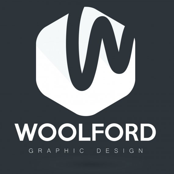
It's just that it looks way too corporate for a designer. It would work great for a cold-blooded, profit-minded company, but not really for an organic one man operation.
For me, when it comes to "brand" yourself, the ubiquitous symbol + wordmark + subtext equation doesn't really work.
You are a human being, not a corporation! It really need to show in your logo.
That's a good point, I hadn't looked at it from that angle.
I'm on the opposite end of the teeter-totter from Charlie, I think it fits well for a designer, with a big "IF". That is if it reflects your design style/philosophy. IF you design with clean lines and strong bold images it works, if your designs are more organic or retro/vintage detailed then it doesn't, I'm sure you get the idea.
Well, I kind of agree with Charlie here, but what would happened if you were to ditch the hexagon and simply use and refine that swirly "W". To me this looks organic and human. I think the hexagon is the main problem for me when it comes to that corporate feeling.
http://www.freepik.com/free-vector/em-letter-logo-template_840925.htm
Busted.