Wordmark Logo Feedback
Kannav Bhatia | Sun, 07/12/2015 - 12:32
Brief from client
Logo will be used various places from building to trucks. So, it should fit the need and should show Strength.
I created this logo keeping in mind that it projected character of strength and is easily visible.
12 Comments
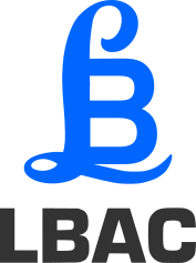
Sorry, symbol doesn't work for me.
@CAMOBAP can you please explain ?
Sure I can. Dig your idea to weld L and B... However, it looks weird now and I start seeing other things like a British pound sign, a P with a curl above B a cobra coiling around B. I would work more on your initial idea to combine L and B and see how far can you go to get a best solution. I think the issue is here is that L and B are representing different type of fonts and merge well together. Logo in this case must be done to have unforced feel.Good luck.
Thanks for the advice, I will work on more Ideas...
I think this is not really working. Using initials to make the symbol denotes a severe lack of imagination and creativity. You just picked two fonts, and stick L and B together and voilà, you have your symbol.
Unfortunately, logo design isn't that easy and it looks like you didn't spend too much time working on this.
Have you made any research beforehand and sketch a few hundred ideas prior to coming with this on your computer?
Also, why only L and B, since the word mark is already made out of initials? I feel no connection between the symbol and the text. The two Bs in two different and non-complimenting font are somewhat redundant and complicate the whole thing.
I would scrap this and start off fresh with a proper creative process this time.
Good luck!
Actually , I won't totally disagree with you.
I am not a professional designer , this is the logo I am trying for re branding my company. So, I learned to design on inkscape as a hobby and came up with few designs one of which is this.
I certainly need to work more on it.
Thanks for the honest reply :)
It's a good effort - especially based on the fact that you aren't a professional. Based alone on the fact that there's an English pound sign (£) - something that I saw straight away, it's not going to work.
Sit down with a pen and paper brainstorm what the company does, write what its core values and products are, what direction the company needs to be heading in along with keywords, ideas.. like the branches and roots of a tree... and come up with angles for visual solutions to represent this. Does it need a symbol? Does it need to be purely typographical? There's lots to explore.
Good luck and be sure to post the results here :)
Thanks for the appreciation, I will surely brainstorm more designs for both letter-mark and pure typography designs. Will keep posting :)
please comment on this logo, I came up with this when I was working on the above logo.
Well it's much better than the original, but you should post it full-size in a separate post. ;)
Two very different letters do not seem fine. I think you should try with one font for the initials of the brand.
Initial logos are exceptionally hard to pull off. :)
The fact that they are a 'go to' for people starting off, makes them even harder to get right.
It is best to just avoid them unless their is a great reason, or it is absolutely necessary.
I do like the blue though. You can have a green thumb!