Brands of the World is the largest free library of downloadable vector logos, and a logo critique community. Search and download vector logos in AI, EPS, PDF, SVG, and CDR formats. If you have a logo that is not yet present in the library, we urge you to upload it. Thank you for your participation.
Version history
Version 1

- I
- S
- T No votes yet.
- C
Version 2

- I No votes yet.
- S No votes yet.
- T No votes yet.
- C No votes yet.
Version 3

- I No votes yet.
- S No votes yet.
- T No votes yet.
- C No votes yet.
Version 4

- I No votes yet.
- S No votes yet.
- T No votes yet.
- C No votes yet.
Version 5

- I No votes yet.
- S No votes yet.
- T No votes yet.
- C No votes yet.
Version 6

- I
- S
- T
- C


4 Comments
Sorry to be the bringer of bad news, but this neither sleek nor practical/modern/simple.
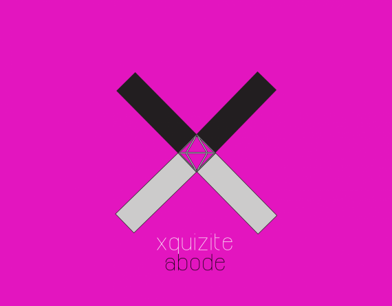
First, you really should put work your logo on a white background. This fuchsia background is very aggressive.
The symbol is killing the workd mark, which is already very weak because of that super thin font. These simplistic rectangles aren't really helping. It just feels like you've riffing directly on Illustrator, without any prior sketching. It really lack personality and that human touch that should be in any logo.
Right now, it makes me think more of a night club in Miami than anything else.
Keep working on it, but stay away from your mouse and grab that pen and sketch and sketch again.
Good luck.
eww... i thought i would score with this version... but.... anyway i gotta 're-storm', i actually get inspiration from some the fashion brand.... by the way thanks for your comment.
Pardon me if this is a stupid Q, is it that the symbol cannot be 'stronger than the tittle.
Do a quick google image search on interior design logos. It should give you some ideas and inspiration. Look at what works and what fails and then just start sketching. You don't have to be good at sketching but the discipline will help you exercise the ideas in your head. It's honestly a discipline I had to force myself to start doing and the payoff is tremendous.
https://www.google.com/search?q=interior+design+logos&espv=2&source=lnms...
Ouch! This hurts my eyes! This would scare any potential client away.