Yoga Happy
Grab Design | Thu, 02/09/2017 - 17:41
Brief from client
A new starting yoga company company from Sweden.
Client: yoga happy
Main topics:
Spread Happiness
Harmony
Balance
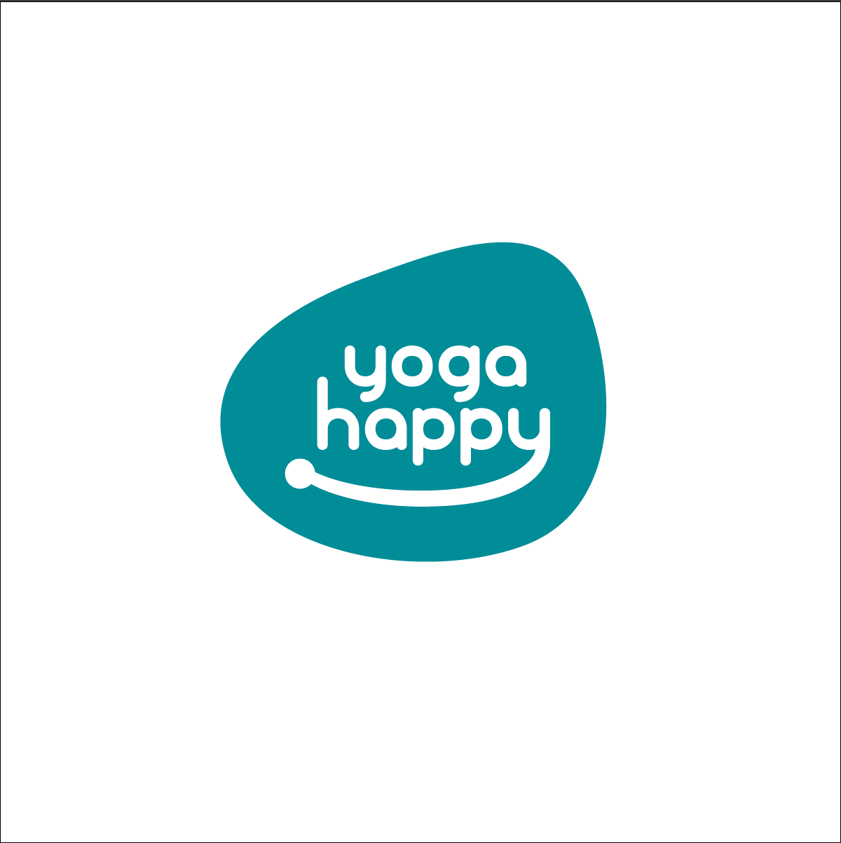
The client wanted so badly at first a circle.
But in my opinion this shape I made works better because it something different and it makes you calm which is the main purpose to go on yoga.
I like this logo design a lot, because you can use the shape as an Graphic element and the smile as an symbol.
I have one problem the client doesn't like the "dot" in the smile. Just a line would not work either, and it looks boring by just take away the dot. Help me I'm stuck! Feel free to criticize the work.
4 Comments
I think this is very close to done!
I agree with the client on the dot. How about a subtle arrow-like shape, similar to the Amazon smile?
I would also make the smile the same thickness as the letters. It just looks a little too different.
Great work!
Thank you! I will look into it.
I agree with above- the thickness of the smile is throwing it off. Smooth that out and match it more with the letters. Also, the "arrow" shape Kills mentioned is a much better approach than the dot you have- it will reinforce the notion of a smile. Good call on the shape (not being a circle) it's fitting and more interesting!
I agree with my esteemed colleagues. This off to a great start but that smile is way too thick and should be fine tuned some more.
Other than that, this is a pretty good logo. Simple and memorable.