Brands of the World is the largest free library of downloadable vector logos, and a logo critique community. Search and download vector logos in AI, EPS, PDF, SVG, and CDR formats. If you have a logo that is not yet present in the library, we urge you to upload it. Thank you for your participation.
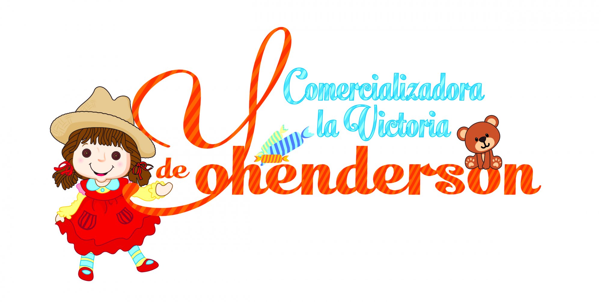
Cesar is right. This can't qualify as a logo. Way too cluttered, oerly complicated with so many bits and pieces.
There's no place for a full on illustration in a logo. Byt the way, did you created this little girl and teddy bears drawings yourself? It feels very clip art-y.
Finally, the text, beside the fact that there is way too much of it, is barely readable with all these patterns. The brand name read "ohenderson". No one will see the Y.
Unfortunately, this is all wrong. You need to restart from scratch, with a lot more inspirations and a lot of sketching.
Actually I think that this one can be saved. Remove a girl entirely. Get rid of that huge " Y ". Make a " Y " out of the three candies by placing them as the letter " Y " goes. Refine your title to a perfection with a new cool font. Love how you place a teddy bear on top of the " o ". Keep the bear, but only if that is your art work. Not sure how important a sub text in your concept - if it is - change to a darker solid color. Keep working on it, good luck!
I remove some extra stuff from your original idea and made a rough beach ball under a teddy. Just to give you an idea how to save this one. My apology in advance for experimenting with your original concept.
Well, it started out as clip art but at least a *little* effort was made to modify the design.
When designing a logo or other branding materials, remember you are trying to develop a unique & original design that distinguishes the client from all others. The client is paying you not just for a finished piece but the ideas that go into it. Basing your work on clip art tells people that 1) you don't have any original ideas and 2) you don't know how to draw them yourself.
A lot of times, a client will provide you with imagery. They may even assume it's okay to use them in the design. Politely explain why you cannot, but it's okay to draw inspiration from them.
11 Comments
There are too many things stacked here.
For me this is not working at all.
Cesar is right. This can't qualify as a logo. Way too cluttered, oerly complicated with so many bits and pieces.
There's no place for a full on illustration in a logo. Byt the way, did you created this little girl and teddy bears drawings yourself? It feels very clip art-y.
Finally, the text, beside the fact that there is way too much of it, is barely readable with all these patterns. The brand name read "ohenderson". No one will see the Y.
Unfortunately, this is all wrong. You need to restart from scratch, with a lot more inspirations and a lot of sketching.
Good luck.
Charlie, speaking about concepts that looks similar... Remember recent Cesar's concept? Sometimes it happens that way.
Actually I think that this one can be saved. Remove a girl entirely. Get rid of that huge " Y ". Make a " Y " out of the three candies by placing them as the letter " Y " goes. Refine your title to a perfection with a new cool font. Love how you place a teddy bear on top of the " o ". Keep the bear, but only if that is your art work. Not sure how important a sub text in your concept - if it is - change to a darker solid color. Keep working on it, good luck!
I remove some extra stuff from your original idea and made a rough beach ball under a teddy. Just to give you an idea how to save this one. My apology in advance for experimenting with your original concept.
love this!
Well, it started out as clip art but at least a *little* effort was made to modify the design.
When designing a logo or other branding materials, remember you are trying to develop a unique & original design that distinguishes the client from all others. The client is paying you not just for a finished piece but the ideas that go into it. Basing your work on clip art tells people that 1) you don't have any original ideas and 2) you don't know how to draw them yourself.
Good catch.
It's not a good thing to add to a logo, anyway. Start over from scratch.
Thanks a lot, all of you are right ill follow all your advices, all images was options from client :( yes or yes keep triying to get better level
Thanks a lot, all of you are right ill follow all your advices, all images was options from client :( yes or yes keep triying to get better level
A lot of times, a client will provide you with imagery. They may even assume it's okay to use them in the design. Politely explain why you cannot, but it's okay to draw inspiration from them.