Brands of the World is the largest free library of downloadable vector logos, and a logo critique community. Search and download vector logos in AI, EPS, PDF, SVG, and CDR formats. If you have a logo that is not yet present in the library, we urge you to upload it. Thank you for your participation.
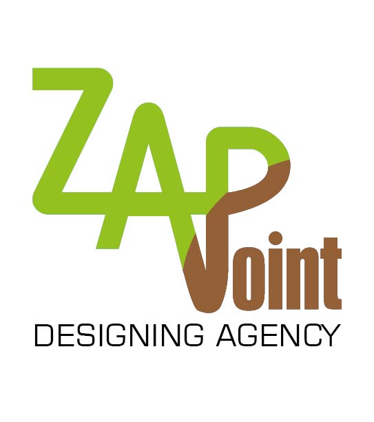
Sorry, but to me, this is all over the place. There is no real reason to throw the extra color in there. "oint" looks disjointed and odd. You might be able to salvage the "zap" part by turning it into a logo instead of part of the type. But it will need some work. I would start over from a different direction.
I agree with G13... you may be able to salvage the 'Zap' part by turning it into the logo on it's own and dropping the rest, but it needs a lot to make it work. The colour choice makes me think this is a logo for a zoo or animal park.
This reads to me as "Zap Voint". I agree with SWATT, the colours suggest a zoo or park... You may be on to something with the downward pointy thing related to "point", but you'd need to re-work it big-time.
Its interesting how "contagious" the first critique is. I tend to differ from your critiques, although this logo is not a hit. It needs some work, but it is really not THAT bad! I like the idea of the single line forming the "ZAP".
There is no ballance in the composition. You created a staircase out of the typography and got a big empty space in the left. This thing does not work.
14 Comments
Sorry, but to me, this is all over the place. There is no real reason to throw the extra color in there. "oint" looks disjointed and odd. You might be able to salvage the "zap" part by turning it into a logo instead of part of the type. But it will need some work. I would start over from a different direction.
ZAP & KAPOW!
Not going to work, I agree with everything G13 said, back to the drawing board.
For a design agency this is very poor effort. Start over from scratch. Nothing I like about this logo.
I agree with G13... you may be able to salvage the 'Zap' part by turning it into the logo on it's own and dropping the rest, but it needs a lot to make it work. The colour choice makes me think this is a logo for a zoo or animal park.
This reads to me as "Zap Voint". I agree with SWATT, the colours suggest a zoo or park... You may be on to something with the downward pointy thing related to "point", but you'd need to re-work it big-time.
I agree with all the others. Start from the scratch
trash it and start over
Trash it and start over.(2)
agree with the above.
agree with the above.
Nothing to add to what has already been said, except that it should read "design agency" and not "designing"
OHMYGOSH! All I see is "Zap Vomit" - I know 'vomit' doesn't really appear, but I tooooootally read Zap Vomit. Sorry!!! :(
(I like the colors though!!)
Its interesting how "contagious" the first critique is. I tend to differ from your critiques, although this logo is not a hit. It needs some work, but it is really not THAT bad! I like the idea of the single line forming the "ZAP".
There is no ballance in the composition. You created a staircase out of the typography and got a big empty space in the left. This thing does not work.