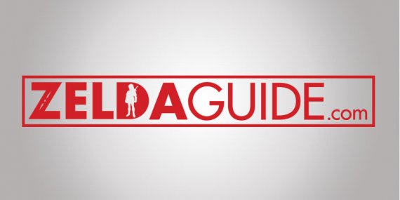
zelda guide logo
demondkitt | Mon, 10/22/2018 - 01:50
Brief from client
Zelda guide is an online company that specializes in the legend of Zelda series. They provide their users with articles, videos, forums, blogs, etc. about the legend of Zelda. They wanted a logo that didn't use the Zelda typeface and something that reminds people of Zelda, but not a copycat of Zelda. Also The logo is going on t-shirts, so I'm limited to 3 colors

In this logo I used the main character "link" from the legend of Zelda series as a negative space for the D. I also used the "futura" typeface because it offers a modern feel to the design. In the "z" I used symbols from Zelda, together this gives the logo a Zelda feel, but it does not mimic any Zelda typefaces.


3 Comments
Ok
I may, or may not be, the biggest Zelda fan on this website critiquing logos.
What I feel like you did, was take a font that is mostly a safe choice, take a really small aspect of the Breath of the Wild logo and made it super thin, and stuck Link in the "D".
If you don't want to be a copy cat of Zelda, ripping one tiny aspect from the Breath of the Wild kind of defeats the purpose.
You have decades worth of material to work with from this series, so many styles to choose from, and so many characters. Even from a logo standpoint, I think this do with some sketching and more creative push.
3 colors is the maximum recommended for logos anyways, as your logo needs to be able to work in black and white.
Look at this logo for Zelda Dungeon.
It absolutely is not a rip-off of Zelda, but it absolutely incorporates the style of Zelda, and you can tell where the inspiration came from, right off the bat.
This is the direction you should be headed in.
No TriForce?