0-0republik
kaosme | Mon, 01/30/2012 - 21:32
Brief from client
The client wants a logo that looks both playful and serious. It will mostly be used on white or light colored background.
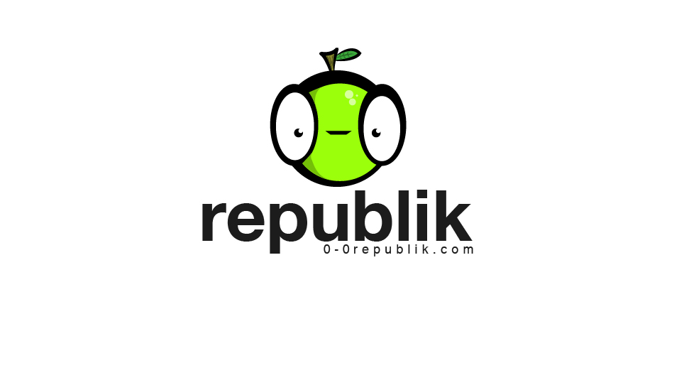
i also left my original drawn font for an actual font to see if it's better. I want your opinions. Should i stick with this font or the old one?
8 Comments
Melhorou amigao!!!
Hmmmm...
I prefer the tailored font you use in version 3.
I also like the font from v3 !!
All the way for V3 for me. This typography is cleaner but V3 is more fun.
V3 as well
This is also good.. but I prefer V.3 too.
The tag line is aligned better here.. but, I still feel it's too small. Not sure why nobody else has mentioned it...?
Yes, v3 was much better.
i like this one but v3 is good too