Ale Logística
rodmattos | Thu, 02/02/2012 - 20:01
Brief from client
Transportation company that hauls containers from ships to storage and back. Has intentions to grow as a full blown transport and logistics company doing business by land, air, and sea.
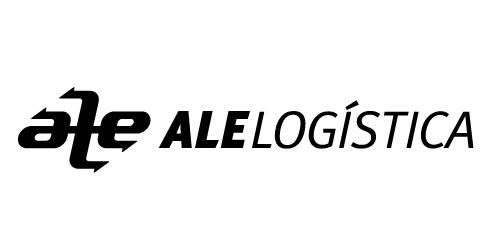
The idea is to have the arrows representing the cargo back and forth on the maze of routes (land, air or sea).
Any way you look, you always read ALE on the symbol.
5 Comments
Nice ambigram but those serifs look like barb wire.
The font is just too dull and too bleh. Find some font that gives personality to the mark.
Thanks,
The barbwire comment helps a lot.
I'll work some new options for the font.
I like the symbol.. but I would use full arrows on the ends of the "L".
The symbol deserves a better more appropriate font.
Arrows currently look like hooks... i'll reserve my font comment for later... I'm sure you have many options...
Like the symbol. It has a uniform feel to it. The typography though doesn't match it. Retry.