lucent vodka
Brief from client
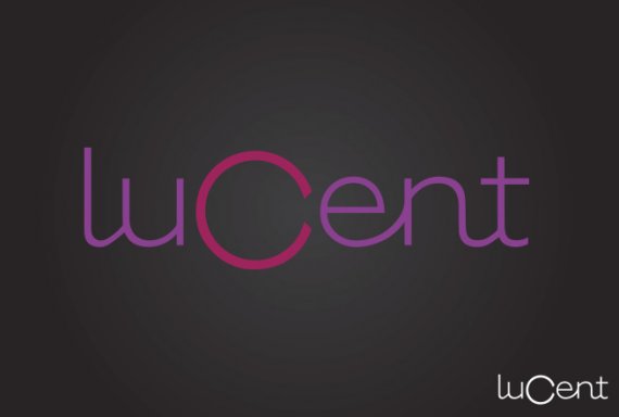
Mock brand identity for my own practice. This will be for a vodka company called lucent. Lucent means glowing, clear, or bright. My inspiration is neon glow, light streaks, backlit photos of clear vodka bottles, classy, luxurious nightclub. Obviously all of that will form more with other aspects in the identity, but I'm wondering if you guys get that "mature youthful luxury" feeling from this wordmark. I wanted the C to be a focal point that could suggest many things- a halo, source of light, eclipse, sliced fruit on the side of a glass (for that I thought about turning it downward some so the opening would match the angle of it resting on a glass, but then the roundness and small opening makes it initially read more as an O.) In any case I don't think this needs to be overthought. There aren't supposed to be any true recognizable shapes or items in this wordmark, but more of just the overall general feeling of youth, luxury, fun, colorful, glow. Thoughts?


6 Comments
Sorry i'm not a fan of this... when i saw the thumbnail i thought it would be a logo for a photographer because the big circular C in the middle reminded me of a camera lens.
BOTW wont let me change the thumbs up/down that i've given for some reason because i want to turn the typography one to down as well, oh well!
I suggest that although creating brand identities for your own practice is a good way of improving it would be better if you created less made up companies and focused more on a smaller amount and improving the logos you have done for them.. I have noticed that on all the posts you have put on here that after the critique we are not seeing any developments to existing logos you have created and that's the part that will help you become a better designer and become better at creating logos. It almost seems redundant getting critique from other professionals if you don't then take any of it on board to try to come up with a better solution. Thats just my 2 cents worth to you. Keep refining your logos to make them into something worth while rather than something that you will not be happy with in a a few weeks time when you look back at them :)
Thanks for the feedback. While I do see what you are saying I know myself and being an experienced photographer and retoucher I know the process I take in order to improve. I do take into account the feedback and critiques I'm given, but then I apply them to new projects. This is just me personally- how I work when at the beginning of learning a new skill. I'm fast and my method is to learn what I can from something that isn't good, then separate myself from it and start with a blank page. Obviously this changes as I get better and work with clients who need revisions, but for now just know that I do appreciate and listen to all critiques given. In case you hadn't noticed most of the comments of "too complex, too detailed" have faded away, because that part of instruction has sunk in. Now I'm tackling typography more with the online tutorials from lynda.com and am wanting feedback on that. So if you wouldn't mind explaining more why you do not like the typography that would be great!
I like the typestyle and the way the letters connect, but oddly it's easier to at smaller sizes. The "lu" are distinctly two letters until I look at it full size then they blend into a "w".
But I like this, it's neat.
I read " Cent " at first without any problems. However, " lu " part needs work and fine tuning in order to settle into your concept. Besides other member's only mentioning about " w " - I, also, see an outline of 7/8 lower case " m ". Would like to see a progress on this concept on a white background, too. My only other concern is how all this relate to a vodka ? I looked at your description beforehand...
Does making the lowercase "L" into a looped script letter help to read better as lu instead of w? Or does this now look just out of place compared to the rest of the more modern straight form letters?
It is slightly better than it was, but not quiet there yet. Perhaps, going with upper case L would be an answer here. Also, I would stay with " u / n " mirrored each other. I still would like see some sort of something with a " C ", as it is a main point of focus in your concept. I think that you are on a right track.