lucent vodka
Brief from client
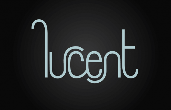
Mock brand identity for my own practice. This will be for a vodka company called lucent. Lucent means glowing, clear, or bright. My inspiration is neon glow, light streaks, backlit photos of clear vodka bottles, classy, luxurious nightclub. Obviously all of that will form more with other aspects in the identity, but I'm wondering if you guys get that "mature youthful luxury" feeling from this wordmark. I wanted the C to be a focal point that could suggest many things- a halo, source of light, eclipse, sliced fruit on the side of a glass (for that I thought about turning it downward some so the opening would match the angle of it resting on a glass, but then the roundness and small opening makes it initially read more as an O.) In any case I don't think this needs to be overthought. There aren't supposed to be any true recognizable shapes or items in this wordmark, but more of just the overall general feeling of youth, luxury, fun, colorful, glow. Thoughts?

Thoughts on this new one? I can't decide if the one line weight is just looking too cheap or if it does help to get across the youthful maturity I'm going for. Again mood is the confident, cool, reserved young person at a night club (not the jumping up and down screaming ones). Looking for modern luxury, but with some fun...so not necessarily top shelf liquor, but upscale nonetheless. Inspirations I'm trying to look at while tackling typography (which is still a huge weakness for me so all comments are definitely welcomed) are neon signs, motion blur light streaks, and the roundness of sliced fruit on the rim of a glass. I'm not sold on the L being lower case, but I'm also trying to keep the word feeling "quiet". So I'm trying to avoid any large swooping L's that are not quite as humble and calm.


11 Comments
I'm liking this one! although perhaps it looks a little childish for a brand of Vodka... I like what you have done with the typography and i suggest that you make the ends of each point rounded rather than straight to help with the whole neon lettering idea.
Keep refining! its getting better :)
This is a very playful logo, well done! It's indeed not very relative to Vodka maybe you're going to add a subtitle to fix that.. The logo itself is very nice to me thought !
Yea I think the design overall is pretty nice, but it doesn't seem like a Vodka Brand logo to me.
More like a etsy shop logo, it looks to cute, playful.
I understand you were going for "fun, youthful" which you have certainly succeeded at. But part of being a logo designer is allowing the logo to fit the context of the product and I can't imagine something like this being taken serious.
Also the curves need to be worked on, I am just trying to help you make it as best as it can be.
I like it overall. i don't know what i think of it as a vodka brand though
I don't think of this as a logo for a vodka brand... which is why I really like it.
Break the standards lucent vodka. I will buy you.
I'm also liking this. Definitely several notches above version 1. It still needs some serious fine tuning but you may be on the right track.
It's a bit premature to say that it doesn't look like a vodka logo. Of course, it doesn't look like any Vodka brand out there, but isn't the veering off the mainstream path a good thing?
What you should is to create mock-ups with your logo. Find a PSD mock-up file of a spirit bottle and apply your branding scheme to it. This link should be helpful: https://www.webresourcesfree.com/free-bottle-mockup-psd-template/
By doing this, it will be easier to judge if your whole branding, and not just the logo, works as a vodka brand or not.
Keep it up!
I do that quite a bit actually. I haven't seen mock-ups posted here, so I wasn't sure if that was allowed or if we can only post the logo on a flat background. Could I post a mock up later on for critique as well? (Critique more on the success of a brand instead of the photoshopping)
Sure you can post your mock up, as long as there is only one logo.
Is much better than the previous one, it looks pretty good.
I like it.
Charlie has an excellent idea, it would be good to see a mock-up.
Incrível!