Leafy fresh
Brief from client
This is from a practice brief on briefbox.
‘Leafy Fresh’ is a take away and delivery service specialising in vegan delicacies with fresh, locally sourced, organic produce. They are looking for a logo which reflects what the company is about. Being a family run, small business, with all meals made by hand in small batches, they want their logo to have a similar handmade, natural feel. The client would like a logo that doesn’t feature the obvious hand drawn leaf, as they feel many similar companies have overused this so they would like their brand to be more unique. They would still like to convey a natural and organic feel to the logo but want to show this in the lettering and through the overall appearance of the logo. Think natural, fresh, organic, custom, handmade and earth friendly.
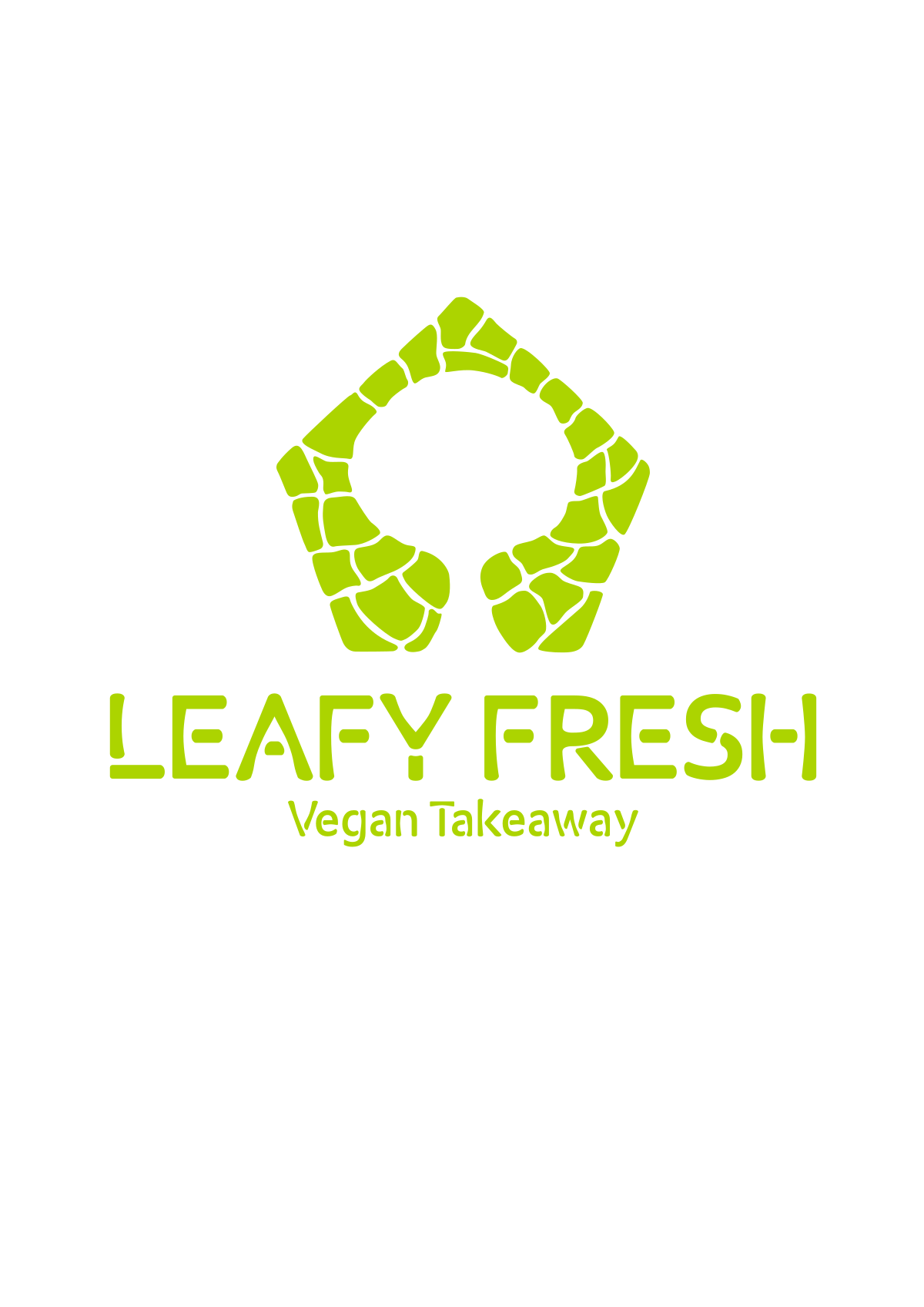
For this version I changed the shape because I found out that most plants with 5 petaled leafs bare edible safe fruit. So going with that concept I also used the cell wall idea and made it look a lot more organic.
Going with the filled in cells I feel it has strengthened the silhouette of the tree.
To make the text feel unified with the symbol I rounded off the edges making it a lot smoother and organic, with the stems indented almost feels like little asparagus sticks.
Feedback will be very appreciated thanks.
9 Comments
I think the plant cell concept turned out really well and there's a nice consistency with the symbol and the text. Double check your subtext. It looks a little off center towards the right, or the symbol is slightly off to the left. I'm liking this and I definitely think this solid version is stronger than your version with the outlined plant cells.
Nice work!
Really good job on this! it looks great! I would play around with colours more though.. having everything all in the same colour for me reduces its overall impact and makes it look a little flat. I would also try a nice neat simple font for the subtext instead of using the same one as the main title.
Maybe this is my nitpickiness, but I wonder if the tree silhouette could be stronger. Right now it looks a bit more like a keyhole.
I agree with the brightness of the green. I'd definitely tone that down a notch.
A keyhole to vegan culinary happiness?
There's no such thing as "vegan culinary happiness" =)
HAHAHAHAHAHA! Not for me but for the most ardent vegan, I could imagine some joy peaking in there.
I think this is a great improvement over the original. I feel like the tree could be worked on more- mostly for me it is the width of the tree trunk. I think it gets a bit too wide at the bottom, which takes away from it being easily recognizable as a tree. But you are definitely on to something!
Also, one more little picky thing =) The letter R. I think you should do the "break" in the letter a bit thicker to better match the other letters- or even better make the "break" between the curve and the vertical line instead of the tail of the R. The type is matching your logo quite nicely. I prefer this version over the outlined version for sure!
I think this works pretty well. A major step up from the first version indeed.
Thanks for all the feedback I really appreciate it. It is certainly helping me grow quicker