Brands of the World is the largest free library of downloadable vector logos, and a logo critique community. Search and download vector logos in AI, EPS, PDF, SVG, and CDR formats. If you have a logo that is not yet present in the library, we urge you to upload it. Thank you for your participation.


6 Comments
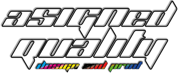
Would recommend using a proper typeface (not downloaded from Da Font), losing all the FX - the extreme gradient cheapens the design and so does the drop shadow, stroke and transparent type, feels like FX overload! Think how this would work small: the 'design and print' becomes unreadable, also the bottom of the G and top of the L and T make a huge space between the 'assigned' and 'quality' words creating a weird space. This wouldnt work that well in black and white either..
To be honest, trying some more options with some proper typefaces and less FX might be a good idea?
Sorry to be harsh!
Hum, i look at this, and i really cant see something good, you need to try something really more simple and take the gradients, it's horrible that gradients.
Agree with bonanzagonzo...
I don't wanna buy it...
At this point, my only advice is to restart from scratch, unfortunately.
And Bonanzagonzo is right about DaFont. Try to stay away as much as possible from it. It filled with terrible fonts.
Have a look at www.losttype.com, great fonts you will find there.
I work for a printing company as well my friend and CMYK is big in the field i guess RGB goes with the design side but Lose that entirely.
There are to many colors and effects going on here. I know your trying to make it look sharp & modern but this is not the right direction.
I would start from scratch and maybe google some printing company logos or something to get some fresh ideas with how they incorporated CMYK into there design... also as a side note even if RGB is used in the design process i still would not use it in your logo at all.
Hope to see your revision! =)
If any of my designers did this, i'd fired them
If any agencies did this for me, i'd sue them
and if your design & print shop using that logo, that would be the last place i'd go.
have some research, get some idea, positioned yourself as your client.
a printing company logo doesn't always to have cmyk elements in it, it could be anything.