aSIGNed Quality
aSIGNedQuality | Fri, 04/27/2012 - 03:05
Brief from client
This is the the logo for my printing and design company. It has 7 versions one each of CMYK RBG as these are very important to my industry.
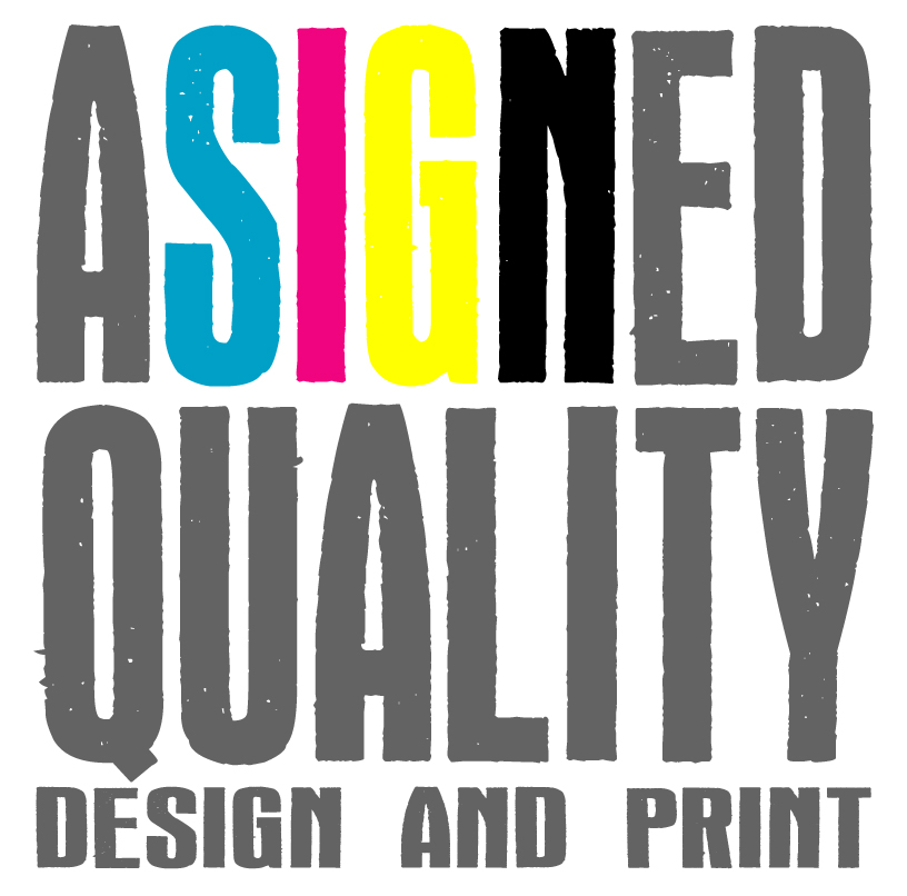
This is the the logo for my printing and design company. It has 7 versions one each of CMYK RBG as these are very important to my industry.
8 Comments
IGNORE THE ABOVE BRIEF.
This is the total revamp,
Better than the 1st one, work on something like this, and try to find an element ho define you.
much better work on that
This is better than the previous design. You might want to think about the image. A grunge type and the word "quality" don't go hand in hand. CMYK and RGB are what you use behind the scenes to make your clients product, it isn't the product. In this case the yellow "G" gets lost on a white background.
This is MUCH Better than your previous one.
There is still some work that needs done on this.
I would change the type style specially since the quality looks grungy
But you are on your way!
Here is VERY FAST idea
(the cross in the Q is the registration marks used on press...
Ok, first of all it looks a bit crowded, like there was not enough space for all the lettering, although it is very prominent and relatively readable. Then I think the font does not resemble the quality, because it looks a little worn. I might be cautious to have my work done here... (first impression only) The word ASIGNED also puts me off a little bit - either "assigned" or "a signed" makes sense to me...
[apologize my bad english]
good starting point to develope logo;
interesting idea to insert crop and/or ® mark in the design…
the CMYK idea is over used..try something else