Brands of the World is the largest free library of downloadable vector logos, and a logo critique community. Search and download vector logos in AI, EPS, PDF, SVG, and CDR formats. If you have a logo that is not yet present in the library, we urge you to upload it. Thank you for your participation.


6 Comments
this was their old logo.
Well it beats the old logo :)
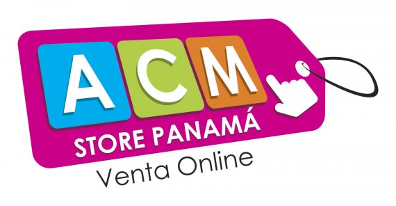
I'd lose the string/ribbon from the tag as it adds nothing in my opinion and the whole thing would work without it.
The 'Store Panama' and moreso the 'Venta Online' text needs to be tweaked with regards to perspective as it isn't quite right.
I'd also use a more standard version of the pointing finger.. (see below) and have it half on half off the shopping tag as it almost get lost or looks like part of the tag itself, when you want to convey that it's something that should be clicked.. (in my opinion). Nearly there though and overall it's looking good and loads better than the original. :)
Finger pointing...
Ok thanks for your suggestions Jon Askill, you're absolutely right about the prospect is something that escaped me, I will follow his advice.
I think your idea is good. Very commercial and appropriate based on their old logo. I think you have too much on the tag though. It takes away from the design. I would remove the hand and definitely try to refine the string on the end of the ticket. The colors are good and seem to fit the company. I would either choose a different typeface or refine this one. It looks like Century Gothic which is okay but isn't the best for logos. Keep working, this is a fantastic start!
Thanks for your comment Kayla Roxanne.
I modified some details while retaining the font that my client has liked.
Here the version with the changes suggested by Jon Askill.