Brands of the World is the largest free library of downloadable vector logos, and a logo critique community. Search and download vector logos in AI, EPS, PDF, SVG, and CDR formats. If you have a logo that is not yet present in the library, we urge you to upload it. Thank you for your participation.


6 Comments
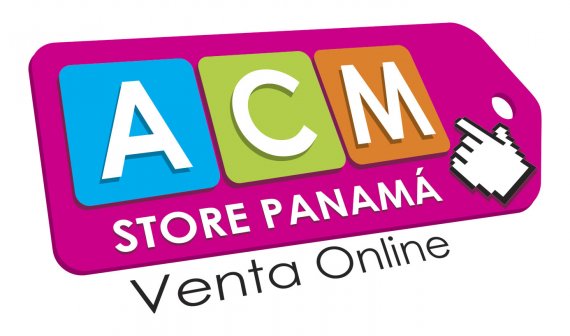
Your text is still not quite right. In addition to tilting it back and slanting it on a line, you have to apply perspective to this. The S in store should be larger than the last A in Panama. There should be a couple ways to do this in Illustrator using 3D or Envelope Distort tools.
I also would argue that the "Venta Online" doesn't fit very well with everything else, but a bit tacked on. I would consider working it in better somehow.
Good luck!
I agree with thekillswitch. Perhaps if you started with the elements true and square, then grabbed them all an applied the perspective to the entire thing at once, the letters would follow their true distortion.
Good point, thank you all for your suggestions =)
Drop the perspective thing. Keep things straight and simple.
Also, it's good to know that this is not a logo per se. The ACM part is. But that's ok.
Keep it up!
Excellent thank you Charlie.
Is a white glove checking for dust? A white glove here doesn't make any sense. Now, you have completely lost a tag - it start looking more as a cutting board.I would let go a perspective idea entirely, I have a feeling that you were looking for extra effect with that, but magic didn't happened. Bottom line I do not feel Panama without reading it and that is not good. I wish you luck in your doings.