Advanced dental training
ccrudden | Mon, 03/05/2018 - 13:39
Brief from client
A brand needed for a dental training provider. Looking for something that will help make them stand out from crowd - as an innovative disrupter, in quite a dated industry.
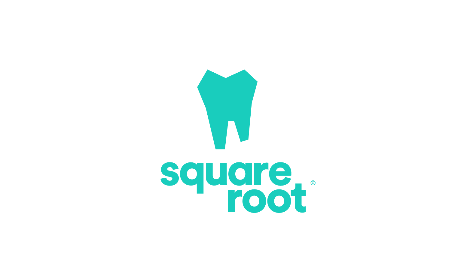
Option 2.
14 Comments
This is my favorite of the three.
Simple and memorable.
The only things that kinda bugs me is "root" popping out on the right, which throw the whole composition off balance. And the copyright sign isn't helping.
Good job!
Sorry, got to agree to disagree.
The blue is almost too medicinal and clinical looking.
I like the font. BUT,
onto the tooth, the design is too rough looking, one doesn't want to think that they will come out of this place with square looking teeth!
Put two circles in the tooth and it could almost be a cartoon character or an odd rendering of spongebob!
I feel with some fine tuning version 3 will take the cake. Brush after!
your entitled to your opinion but consider your argument-"too clinical and medicinal"..... and "come out with crooked teeth"
This is a dental TRAINING school- not a dentist office, and I certainly hope its clinical and medicinal if they are training essentially dentists! lol
Your reasoning actually supports the opposite! =)
I don't see it that way. Regardless if it is training or not you don't want crooked or square teeth.
Also, there is a feeling that people get of discomfort when in hospital, medical, clinical, dental settings, of anxiety, thus wouldn't you want to have a more inviting logo not medicinal?
My argument was also in support of logo three and just pointing out some reasons why I feel it works better than this execution.
Your critique would make sense if this was an actual practice, and not a school.
I think a more professional logo that isn't a character works fine for this. And I think the font is more inviting than anything else.
That's like saying "we are a tattoo school that trains new artists and because we are a school we are going to spell our name TATEW Trainerz" But Don't worry we will make sure the trainee that does your tattoo pays attention to one of the most important details spelling.
Doesn't matter school, dental school or dentist to the stars.
I had stated in two versions I thought the typography was a nice choice, yet in this version 2 the color does not work as well as in 3.
...misspelling a logo in a tacky way isn't related to this at all though.
They have a minimal symbol, a clever name, and inviting typography. It matches the vibe of the business they're in.
It looks like you just took the negative space from the first iteration and made it positive space. I find it to be much less pleasing to the eye than the first.
Erin, crooked teeth are bad! It doesn't matter if you are learning how to make teeth crooked or if your own teeth are crooked. They just simply should not be associated with anything related to dentistry....
true you have to be careful with "tooth" logos- but just a little devil's advocate- does it change anything about that when the company name is SQUARE root?
As for being careful with tooth logos- here's a little morning funny for you- this was sent to me for signage design......I literally lost it!!!! =)
There's a butt in that tooth! It will certainly make people think that they will get out of there with a foul breath! ;)
This is the argument I'm not really getting.
They aren't trying to attract customers, they aren't trying to attract people and say "here, we can make your teeth straight".
This is a logo for a school, where you are learning to deal with people's screwed up teeth. The style of the tooth matches the name and the concept. If the crookedness is really a problem, then just suggest she lengthen the stem of the right handed root of the tooth.
But the wonky shape doesn't give me a negative vibe at all, it just looks geometric.
The bottom line here is with any business, one wants to portray success in whatever it may be. Straight teeth, Making Money, Safety, Good Tires, whatever.
So, for the representation of your business, school, training lab, etc., you want to put your best foot forward, so that one of the people they actually get to practice on, already has a feeling of confidence instilled in them from just a glance at the logo and maybe a brochure.
I will make one more analogy, if you don't see it - let's agree to think differently.
I am a brokerage firm, the assignment is a stack of money and coins in the logo, I want the designer to portray, success, wealth management, and an upward trend in my business' ability to grow wealth, do I put 5 stacks of pennies and a 5" roll of singles? Or maybe bank banded fresh stack of 100's with a stack of Gold 1 troy oz. coins on the side.
It's the point. School, fine you want your students to be successful and fine tune teeth, not make them square and edgy.
The third version shows an outline with negative space of a tooth, and while somewhat angular, it is clean looking.
And how many brokerage firms have actual money in their logo?
Have you noticed that there's no burger in the McDonald's logo? Or that Shell isn't the crustacean business?
Actual seasoned pros know that one shouldn't be too literal in their logo design and not shy away from giving a stylistic twist to it. Which is exactly what the OP did here and why his logo actually works.
1. That was not the point.
2. It was an example as if someone were to ask for that in their logo and what the better choice would be. Could have been talking about different types of dirt for all I care. You show the richest, not the blandest, IF REQUESTED BY CLIENT.
3. If you actually read what I had written you would know I am a fan of this logo, yet I feel version 3 to work the best so far.