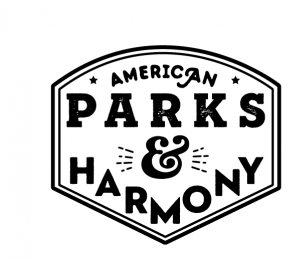
American Parks & Harmony
ErinsSonicYouth | Thu, 10/19/2017 - 19:44
Brief from client
So I'm working on the actual branding for my line of parks logos.
I loved the idea of something typography based to contrast all the illustration work I put into the collaborative designs. That way it wasn't overbearing, however still tied into my collection.
I'm attaching the same logo in black, in a single color, and in my gradient technique.
3 Comments
**Just my opinion** I would remove the flourish from the A in American, let the adorable ampersand be the fancy part. And I would curve the bottom of the badge like the top and let Harmony follow that curve.Or even make it straight? Not feeling the text in a V shape. I am on the fence about the font for Harmony- right now you have 3 (technically 4?) fonts in one small badge. It may look more "harmonious" if the font matches parks =)
It's actually only two fonts, one is just the serif version and one is the slab. American is the *second* font.
I'm not just tossing blue into the single color version, what earthly sense does that make.
I'm confused as to why my original image was cropped, but ohwell
I like the intention behind this logo. You tapped right in the kind of vintage typography based shit I love.
Now, there's way too many different fonts in there. You need to simplify this.
But there's definitely something good going on there.