AquaCell
eriksson2992 | Tue, 03/17/2015 - 23:41
Brief from client
for a local business that sells drinkable water and cellular phones in one.
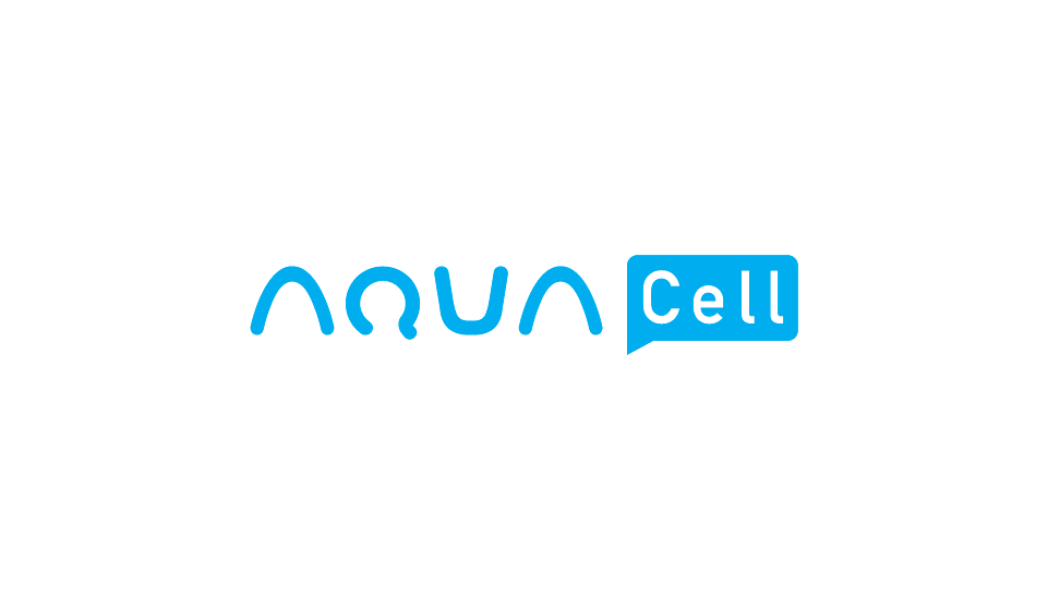
okay so brought everything closer together. adjusted the width on the A and U. a bit more pointy i guess to not get it confused with N. I tried the upside down A as a U but i didn't feel it fit well together, so i adjusted the top ends of the U and opened them up a bit. Also text bubble and text centered and increased their size. So what do you guys think? does the U work bit more now or still think upside down A would work better?
4 Comments
Better than version one. And I like the typographic experimentation. But I think you can improve further if you replace the U with your upside down A.
Great improvement indeed, but as I said in version 1, you're probably better off substituting the U with an upside down A. Your logo will be more consistent.
Good job!
I agree, it does look better. The U as an upside A is a must. Also i like that you've narrowed the 'A's a little bit
I think you are headed in the right direction but I would perhaps maybe explore the idea of making the "u" into a glass of water. I don't like the way the letters work now. You could continue with this idea but maybe form the letters in a new way. And as far as color I'd like to see a blue that more closely represents water, this blue just reminds me of cyan and printing. Keep working on it, you have a good idea and it is definitely headed in the right direction!