AquaCell
eriksson2992 | Sun, 04/26/2015 - 10:03
Brief from client
for a local business that sells drinkable water and cellular phones in one.
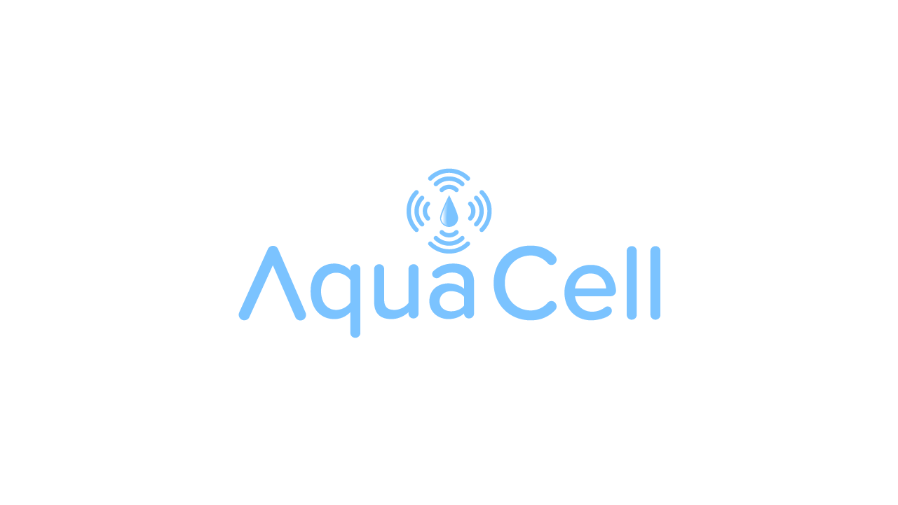
Okay so they seemed to like the symbol. But asked for a different font. I thought id take the A from before and just use a regular font for the rest.Also changed the color to a more "water" looking color.
3 Comments
Sorry, but a symbol is still weak and far from being done. Immediately I see a fan with its blades in motion and a tear/water drop is very hard to notice. In my humble opinion as a logo of a water drop surrounded with WI FI symbols doesn't work as unit. Somehow it reminds me a heating plate on a stove. What I suggest is that to make a water drop out of a negative space inside an " A " in " Aqua " and then put top, left and a bottom WI FI symbols out of your logo minus a water drop in a replacement of that boring " C " in a " Cell ". That way it would make a whole lot of sense and look sharper. Hope that I help you on this?
Something like this...
Nothing will erase the glorious memory of version 3.
If you have to make a new one, just go a totally different way.