Bark Nouveau
M@ | Wed, 07/20/2016 - 16:19
Brief from client
To create a logo for a company selling organic dog food.
they would like the the logo to be in the style of old beer mats and vintage looking.
Include an image of a wolf or dog that doesn't look too angry
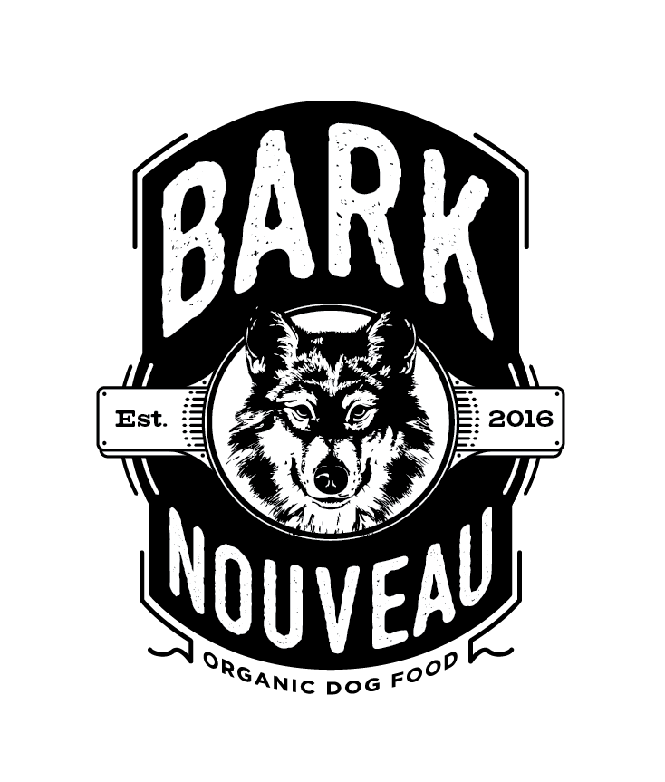
So based on the brief this logo was right up my street! I look forward to your comments. Thanks
9 Comments
Here is a couple of other ideas too:
I like the overall idea you're going for, but it seems to contain a few clashing styles. Is it supposed to be grungy, or clean and orderly? Also, I'm not sure I like the lines around the edges. I would simplify a bit here.
Among your other ideas, the first two look better.
good point about some parts being grungy and some not. I think that the final version will end up with a slight grunge effect running through the whole logo but for the moment i just wanted to see what the thoughts were on the overall design and layout.
I must also add that I will end up re doing the wolf in the middle properly at some point, the one that is there at the moment was just to fill the space
I was going to call it into question, since it looked a bit clip-arty, but I wanted to give you the benefit of the doubt :)
I am quite fond of this!!! I think your pup is smirking, but that's ok! lol I am also a fan of the rounded version (#2) that was uploaded.
My only comment would be the way the tagline looks warped into a curve and not perfectly curved as it is in the rounded version. I think you should fix that.
I'm also playing a bit of devil's advocate- because to me the elaborateness I would usually say simplify, here I think it works. Especially in packaging, you can get away with more of that. I like the extra lines and embellishments. I vote keep em!
Good work on this!
Great start, I agree with Kill though there are a few clashing styles that need to be resolved. On the alternatives I feel the second and third ones are better solutions because the dog head is easier to visualize, on the black backgrounds it is a little lost to my eye.
I agree with most of the above, but it should be said that the word "nouveau" means "new", and in that context I think it's a bit odd to use a retro style illustration.
Well, it's also an art style that is in reference to organic, elaborate curved shapes.
I appreciate the critique of Bark Nouveau's branding! It resonates with me as I’ve navigated similar creative challenges in my own design work. Balancing aesthetics and functionality is always complex, but it's rewarding when done right.
https://geometrydashlite2.io