Canal Cycle
Brief from client
A bicycle hire company in Amsterdam would like a custom logo design. Canal Cycle is situated in a popular tourist area within the city & would like to appeal to visitors with a strong & modern, typographic logo. They would love a logo using custom type, so be creative & bold!
Target Audience: City Cyclers
This is a brief from a website called briefbox which has a lot of practice briefs. I am new to logo design so I thought it would be good practice to start there.
Going on the reference and the brief provided I created script lettering with thick lines and not too much contrast between them, which to me stands out and shows boldness. Also I tried to achieve that modern feel with the script.
I am new to logos and eager to learn so please don't hold back.
Thank you
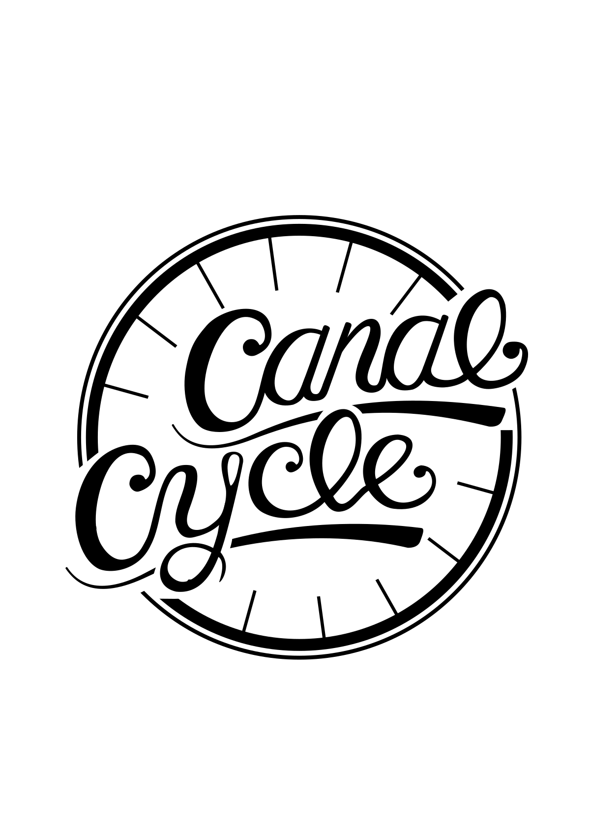
So going on the critiques I received, I tried to make it more of a mark to stand on its own and also create a cohesivness in the line thickness.
I added a bicycyle rim, sort of the older style 8 spoke ones, I did not want to add the tires around it I felt it was a bit too representational.
7 Comments
Absolutely beautiful!
I see this as a mark not a logo, something that will last for years.
All I would really do is just clean up some of the letters and make them more neat.
Well done!
Oh sorry I forgot to rate :)
And also i would like to see a version with the tire.
This is shaping up nicely but I do see some areas that could be refined. The ligature between the l and e in cycle looks a little rough and could be smoothed out to have more of a natural flow. There's a little bump inside the loop on the y. The other things I see are the breaks in the rim look too squared off. I would contour these more to fit with the letters they end around.
This is looking pretty cool though.
Yes I agree
You need to look at the loop on the "y" and the connection between "le" in cycle. I like that you are trying to vary your lettering a bit, but it still needs a bit of refining. This is an improvement, keep working on it!
Yup, this works very well. The hand made word mark is far from being perfect, but that what makes it thrive!
Now, the symbol needs some more work. Mainly because it's too clean as opposed to the beautifully flawed word mark. You need to make it graphically more consistent.
Good job so far, keep it up!
Thanks a lot for your critiques I will take them and see what I can do