Cross Media Productions
XManBG | Mon, 02/20/2012 - 22:14
Brief from client
Hello everybody, it is my first try to design a logo for a new company. My idea was to leave as little text as possible. I took only the initial letters for Cross = X and M and P and made symbols out of them.
The meaning of "cross" corresponds to the company goal, that it should manage two design directions: industrial design and web design, which are different media, I assume.
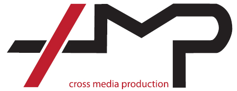
Hello again... after some time, we have issued a new try with that logo design. I'm curious about your comments now...
3 Comments
I like it.. but without reading the tagline I read "IMP". I dont see any cross.
But maybe this is just me. :)
Kinda looks like "AMP" to me.
you have tried this idea before and it didnt look good. personally i think that linking the letters in this manner doesnt do you any good. i like the symbol. maybe keep just the cross as a symbol and the rest just type. by the way current font not working too well. you can do better.
good luck.