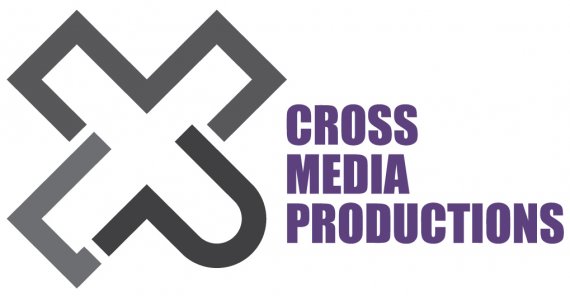
Cross Media Productions
XManBG | Mon, 05/14/2012 - 21:48
Brief from client
Hello everybody, it is my first try to design a logo for a new company. My idea was to leave as little text as possible. I took only the initial letters for Cross = X and M and P and made symbols out of them.
The meaning of "cross" corresponds to the company goal, that it should manage two design directions: industrial design and web design, which are different media, I assume.


5 Comments
Great idea, in theory, but for some reason I keep coming back to that "P" looking like a "?" I'm sure there's a solution for that with a bit of tweaking. Also, colours are bland.
I do like the idea as well, but agree that the P is not quite P like. I would also make the C more C like... looks kind of like L to me now.
Great evolution. Can you show us some more font options?
Agree with geracao, try more fonts, and can u design a different symbol? More simple?
Reminds me a bit of a medical institution...