D B Cummins
Brief from client
Our current logo needs updating.
Might look to get rid of the D B and change the name to just Cummins.
We are a demolition and groundworks company and our logo will need to work on lots of different coloured vehicles, social media, clothing etc.

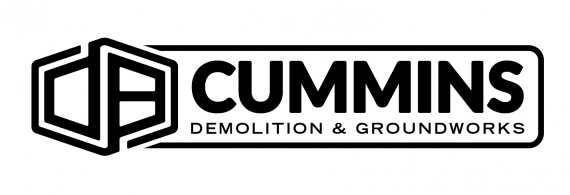
So here's my first stab at creating this logo.
I thought I would make the D B look more like a symbol than be readable as the main focus they want is the word Cummins.
The D B also creates a kind of 3D looking building/block which helps tie in with the type of company the business is.
I think the Bold black lines also help with the construction feel and will help the logo to work on different coloured backgrounds as it needs to.
Colour scheme is yet to be decided but I have been working on some. These will come once i have the logo nailed.
I would like to hear your thoughts!


7 Comments
This totally works. Good job, M@
My only critique, is that you choose a font that has a better contrast with "Cummins".
Other than that, this is very effective.
Is Demolition and Groundworks aligned with Cummins? It looks like the tagline is just a little further left??? Could be my eyes!
Otherwise, I dig it.
I'm not really feeling this one, unfortunately.
All I read is Cummins. I'm having a hard time deciphering DB.
Also all these strokes have different weight, which isn't great for consistency.
The way the frame around the word mark ends up in super sharp spikes clashes with the more rounded ends of the other strokes.
The symbol is cool on its own, but not as part of the word mark. I would have DB Cummins fully spelled out.
I think the box around Cummins totally distracts from the letter mark and is totally unnecessary.
Thanks for the feedback, I'm happy with how it looks and have been playing around with some colour combo's.
Its going to be an awkward one as it will need to work on lots of different coloured backgrounds.
Below are the combinations I think work well. My favourite is the dark blue background with the light blue and orange logo.
I need to provide a couple more logo ideas so I will be working on them over the next couple of days.
i'm liking this version, but it was me i'd delete the borderthat goes around the text