Brands of the World is the largest free library of downloadable vector logos, and a logo critique community. Search and download vector logos in AI, EPS, PDF, SVG, and CDR formats. If you have a logo that is not yet present in the library, we urge you to upload it. Thank you for your participation.


7 Comments
Too much text, but this one is better.
Apply the same rules everywhere for your typo.
The client wants that text, no way around that. I did the best I can with what the client gave me. Also the colors are what the client requested.
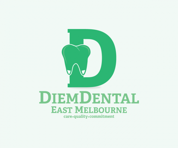
Again, the symbol is too complicated and doesn't make much sense. Why don't you keep things simple and get rid of that D.
There's nothing really wrong about having so much text, but make sure that your basic iteration doesn't have any subtext. Having different versions of the same logo, which you can swap with each other depending of the context is always a plus.
The colors are better, but the bright green on a brighter green is still hard to look at, especially with so much text.
Why just settle for a tooth, it has been done hundreds of times before. I just wanted to mix it up. Good tip on the colors maybe I can change, the client asked for this type of color but I see what you're saying. I appreciate the critique.
*whispering* Keep the D, with the tooth in negative space inside it.
Is that about what you had in mind ?
;0)
I'd add a little more white space around the tooth. As an alternate idea, have you tried making the open space inside the D the shape of that tooth?