Dope N' Natural Pittsburgh
Brief from client
Dope N' Natural Pittsburgh is a natural hair meetup group for African American women in Pittsburgh, Pennsylvania. At these meetups women come together and share natural hair stories, tips on proper hair care, provides samples of hair products to try, etc. Usually vendors are present at these events selling homemade hair and body goods, organic products for hair and body, and jewelry. The logo will also be marketed on t shirts, which will be sold at these events. The client and originator of this group makes her line of jewelry and will be selling her own jewelry at these events as well.
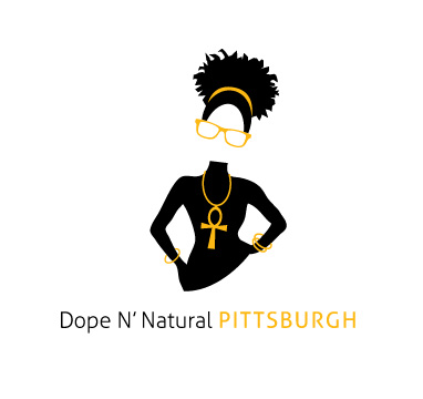
The artwork is a funky and hip African American girl. The logo has to be black and yellow (gold) because those are the official colors of the city of Pittsburgh.
I was hoping that the typography could stand alone even if the girl isn't present, but I also don't want the type to be overdone because it will take the focus away from the girl. They both have to work in conjuction and separate. I'm unsure that the yellow in "Pittsburgh" will be readable. Help needed. Thanks guys.



5 Comments
Overall I like this logo but I feel it a bit too detailed for the logo category. I'd consider giving it a try without the body, just the head could do the job perhaps. My other concern is the font type. It's too thin, too weak, the graphic kills it completly.
I like it... but try to work a little more on the fonts.
I agree with oscar about this being a little too detailed for a logo. It's also really tall. Don't get me wrong, I DO like what you've done with the illustration, it's just that it's more of an illustration than a logo!
As for the font- I'd definitely try a few others out, AND I'd stack it. How about having DopeN'Natural on one line, and then Pittsburgh on the next line- neatly stacked and kerned out to be the same width!? Maybe pick a fuller/stronger font that stands out more. The one you're currently using is really thin and disappears a little. (Especially with the yellow Pittsburgh!)
Oh, and would you consider using a different font for the yellow part?? Like maybe (once it's stacked) have DopeNNatural in a sans serif, thicker font, and then Pittsburgh could be another font in yellow beneath!? Just an idea!?
Then just simplify or cut off a part of the lady- to both reduce the height as well as just making it more logo-like in general. A lot of those small details (bracelets, etc) won't show up if/when this gets printed on any kind of smaller scale!
Excited to see where this one goes- please upload updated versions when you have them!! :)
Ok! Thanks for all of the input! I DID initially design her for the purpose of printing on tshirts, so that's why she's so detailed. I do understand what you guys mean though by simplify her. So I'll see what I can do. Maybe I'll just keep her full-bodied for tshirt purposes. Back to the drawing board...
keeping with what's been said, maybe if you loose the ankh and the single bracelet on the right hand it might make this look less busy. I like the silhouette and the overall feel of the figure. I think it would be safe to add some red into the mix, both more more african flavor and contrast. The Steelers logo has red, blue and gold, and is definitely a Pittsburgh icon.