Elle Rodrigues
edpinheiro | Tue, 10/18/2011 - 20:34
Brief from client
Logo for my firm promotional gifts company.
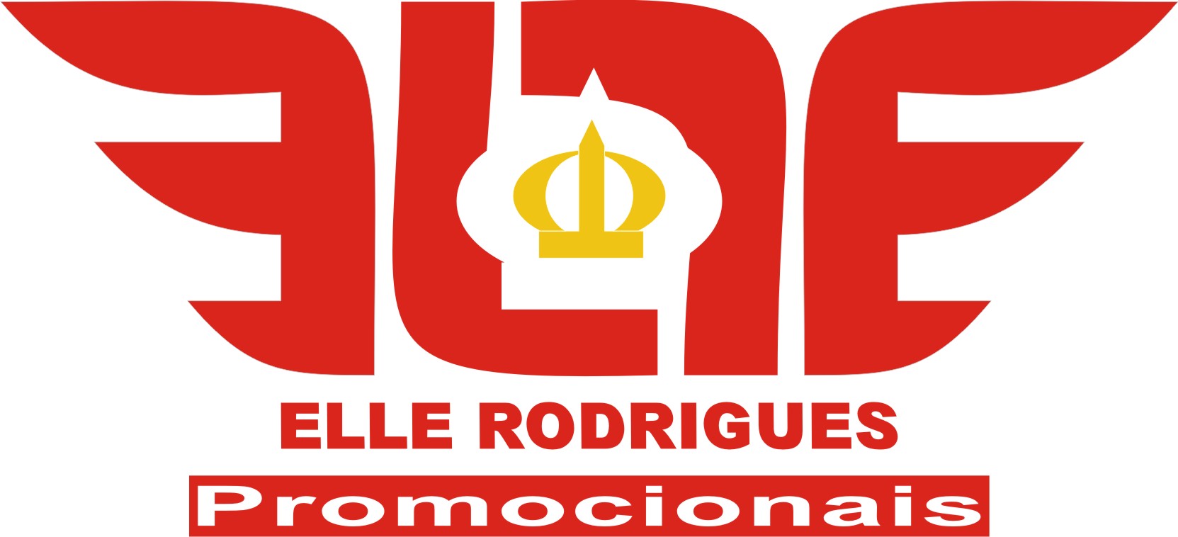
Elle represent the letters that are my first name - edson, my wife - luciano; with my second child - lucas: and my first child - edson. How created after, the born arthur (the third son), put the crown centralized (king arthur).
The intention is to create an idea of freedom, with the letters "e's" flip, like wings. Imagination loose.
The letters "ls" is, if in reference to close "down to earth", organization, discipline. So basically wanted to say: "liberate your imagination, but keep feet on the ground" ... I think that's it.
4 Comments
I think the symbol made from the letters is nice, but a bit boxy. Doesn't feel light and imaginative. Perhaps add some curves for the LL part too. The typography below is too bold and too close. Give it some space. I would also add some lighter colors, black is a bit too serious.
Agradeço a atenção e as dicas. Fiz alguma alterações e apreciarei suas considerações.
I agree. It looks old. Doesn't tell me freedom.
the logo does not translate the nice story behind it. it looks to formal, unbalanced and has kerning issues. the crown is a bit out of place considering the strength of the other elements.