fhochdrei
Hegden | Wed, 01/11/2012 - 01:29
Brief from client
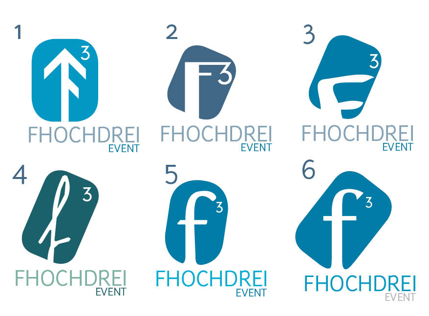
Hey, this should be a logo for a small event agency. With the name "f cubed event"
Now I'm thinking about the colours (blue is a must mostly)
and maybe a final general change?
Hoch means up. So maybe the arrow could be an idea.
Thank you very much for your last answers. They were very helpfull.
5 Comments
If these are your final ones, then I would say that the 'f' in number 6 works the best. But the shape around it doesn't seem to be working. You should possibly use the style of 1 with the font of 6.
On the other hand I still there could be a lot more done to this logo but if you are pressed for time then go with my advice above.
hope this helps.
I'm out of f's ;)
Like this?
What do you mean with a lot more done? :)
It's best if you post one logo at a time. I'm unable to comment on so many at the same time.
I think you should literally cube the "f" and get rid of the "3". (I think Splash said that on an earlier version).
Then it would be graphically interesting enough to get rid of that background shape.
Dog-tag color:
I think #3, #5 and #6 use the same color. That's the one I like.
"f" font:
I like #6. (#1 is a no-no)
"FHOCHDREI" color:
Pick #5
"EVENT" color:
Same color you pick for the dog-tag.
Dog-tag orientation:
#1, no doubt.
Cubic symbol:
I don't like any.
Let's see how it looks now.