Freelance graphic designer/Illustrator
Brief from client
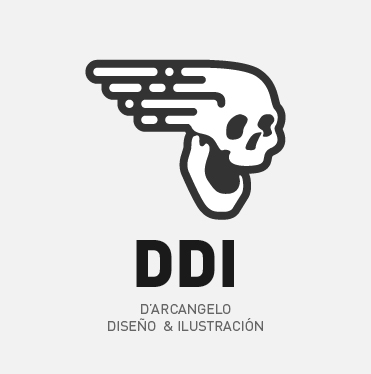
Im cracking my head with this one that is a concept for my own personal graphic design / illustration logo.
Im attempting to stay as far as possible not from the concepts, but from the typical symbols that represents creativity, art, ideas (i mean light bulbs, pens, brushes, etc), so i kinda took the crazy train and went forward with this skull "in motion" symbol.
I tried to merge the illustration part that its represented on the face (which comes from a draw i made, which is more organic), and the graphic design part on the wake of the skull (which is totally based on geometrical shapes).
DDI stands for D'Arcangelo Diseño & Ilustración (D´Arcangelo Design & Illustration) that its my last name... Which is not catchy at all to be a title... So i went for an abbreviation.
Given that a skull has some negative charge ... I tried to make it the friendliest i could, but trying to not fall in some "cute" design.
I will wait for your opinions guys.
Thank you!
3 Comments
Ok, you got my attention, the skull looks awesome , simple, nice, tidy, clear, expressive, dynamic, is not the kind of skull i would think about when is about logos. The idea of having a skull as personal logo is not debatable, is a good idea and that's it.
Now, when is about typography we have a problem, is from somewhere else and it makes the whole thing look bad.
There's two suggestions I have for this.
1.Incorporate typo in the skull, in hair.
Play alonh and take time, it may not come out well from the first try.
OR
2.Choose something rounded and modern and friendly instead of this vertical , neat and neutral type.
Good luck there
Hueroth,
Thanks for your opinion and advice! Given that i do not count with a lot of time for this (because its for a College's exam) i will definetly go with your option 2 just for now. Will try to be uploading some new versions in the next hours. Thanks again man!!
It looks cool, but the mouth looks a little strange. And you make illustrations based on the photo. I wonder how difficult it is to turn such a photo https://www.youmagine.com/davidosborn/designs into some cool logo. I have been looking for a good idea for a long time.