Freelance graphic designer/Illustrator
Brief from client
Im cracking my head with this one that is a concept for my own personal graphic design / illustration logo.
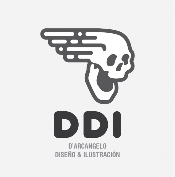
Im attempting to stay as far as possible not from the concepts, but from the typical symbols that represents creativity, art, ideas (i mean light bulbs, pens, brushes, etc), so i kinda took the crazy train and went forward with this skull "in motion" symbol.
I tried to merge the illustration part that its represented on the face (which comes from a draw i made, which is more organic), and the graphic design part on the wake of the skull (which is totally based on geometrical shapes).
DDI stands for D'Arcangelo Diseño & Ilustración (D´Arcangelo Design & Illustration) that its my last name... Which is not catchy at all to be a title... So i went for an abbreviation.
Given that a skull has some negative charge ... I tried to make it the friendliest i could, but trying to not fall in some "cute" design.
I will wait for your opinions guys.
Thank you!


7 Comments
I like the skull, I like the font, I like the colour and I like the overall look.
The DDI is dark while the sub-text and the skull got slightly different shades that is almost the same. I think if the type is the same shade and the skull is another would work better.
I agree with mahayni here.
Mahayni,
Thanks for your comment! I've took that color decision because i thought that it would create some levels of hierarchy. Given that the typography is way more simple than the symbol in terms of complexity i thought that a darker color should give it a boost. Either way i've applied your correction (down here) and i think that everything is more unified but it looses that levels of hierarchy. Now i need to flip a coin here, because i find valid both points of view hahaha OR try to make them both work at the same time. Again, thanks for your opinion!
:) looks good!
You can give the skull a different colour than the type and not 2 different colours for the type, if you know what I mean. That way it works for both points of view - I guess -
The only thing I don't really like about this is that the blur line looks like a wing. Or is that intended?
nothing to say except that i dig it!!! (the second version you posted so everything matches to gray)
I love this logo. Although I usually prefer when graphic designer freelance designers don't brand themselves like a corporate entity, this is totally diggable.
I'm just not sure about the placement of the subtext though.
Great job!