Gorgor
Bariqo | Mon, 06/22/2015 - 15:02
Brief from client
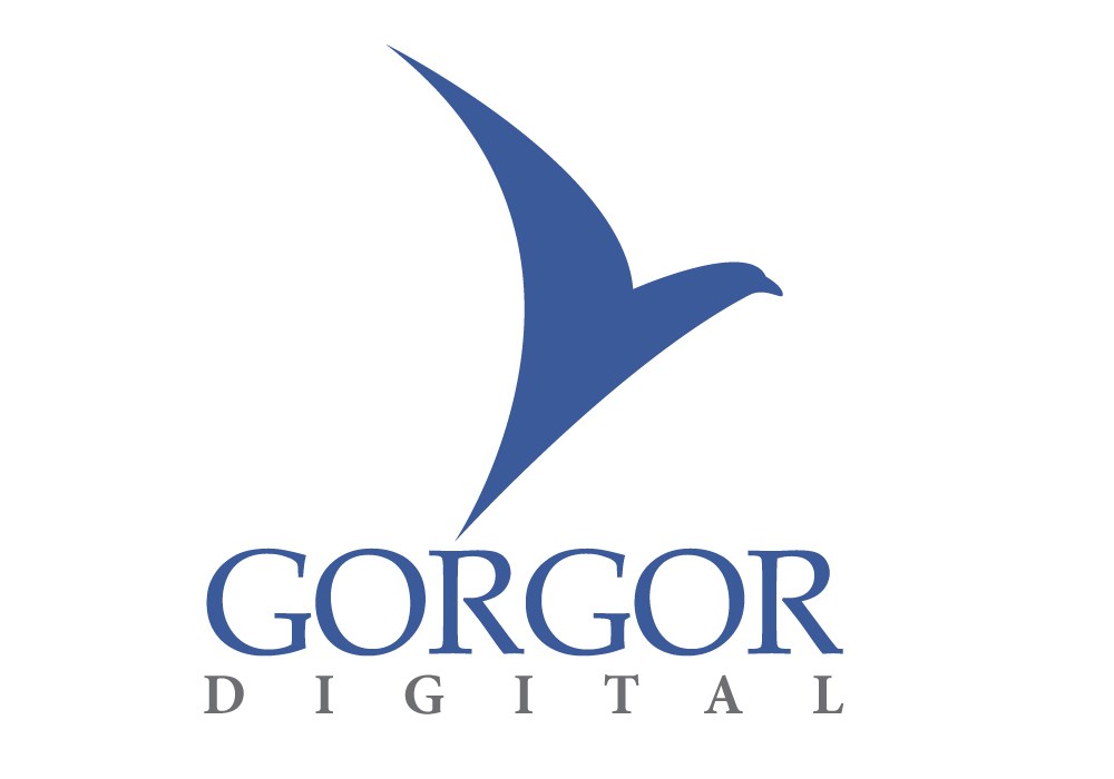
They wanted an eagle since the word gorgor means that in the local language. They are printing firm. They didn't want an actual bird.
They wanted an eagle since the word gorgor means that in the local language. They are printing firm. They didn't want an actual bird.
5 Comments
I really like the simplicity of this. I also like that you didn't try to use a representation of CMYK for a printing company, thank you!
The eagle would probably benefit from a little more breathing room. Move it up just a touch. :)
Nice job overall. Like Cooperads, I really like the simplicity.
I think you could spend a bit more time on the fonts. I do not find the same sophistication I find with the symbol. Chiefly, fix the kerning and maybe find more complimenting fonts.
Keep it up!
I nave a concern about the eagle part in your symbol. I do not see eagle in there, instead I see a pigeon the way beak is pictured. If you focus on a center part of a symbol where wing and a neck merges - then it start looking more into that direction if you would make another wing instead of a neck/head combo. I do believe that would be a better more abstract looking symbol that is kind lean into a paper feeling that can be associated with a printing industry. Find a better font, this one doesn't go well with a symbol. Another point I want to make is that nothing here says about digital without reading a subtext? Good work, good luck.
Thank you for your input and you all have valid points. Camobap, I will look into that but I don't want to over analyse nor over complicate. The long wings should be enough to differentiate from a pigeon. I have revised the beak/head. I was inspired by the Qantas logo of the kangaroo.