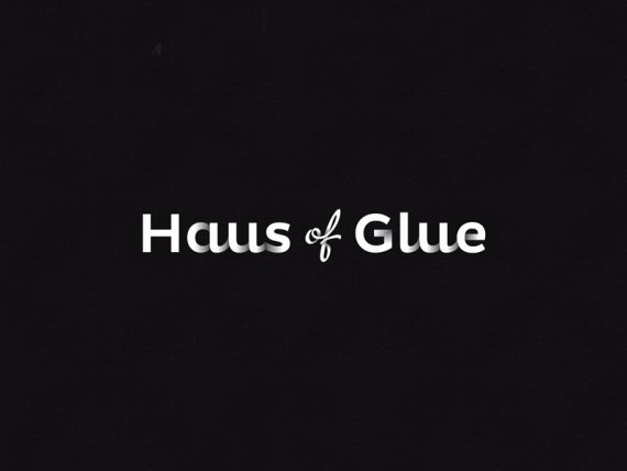
Brief from client
A typography lead logo
No fancy boarders around the logo
A simple detail on the lettering to make it more distinctive
A dateless font - No irregular angles
Black and a white version
Premium, luxury look, not rustic

Nice and simple and lots of fun!
5 Comments
Love this Joe, just think you need to tighten up the space between H & the aus and the same with the G & the lue. otherwise perfect.
Now that you said it seems so obvious!
A very good crit indeed, Thanks lee!
Another great job.
I would just remove the gradient on the G.
I've got a little idea for the G, Will come through in the next round of idea's. watch this space
Waiting new version, it's too cool, but with the previous ideas i think is would be perfect! Great Job!