Hobbease
Brief from client
Hi, we’re Hobbease. And you’ll be seeing a lot more of us soon.
When you subscribe with us we’ll send you everything you need to pursue your favourite hobbies. As well, Hobbease.com has video lessons, and tons of supportive material to go along with the packages you’ll be receiving.
Hobbease is for people young and old who are interested in learning new things. Or if you already have a favourite hobby, no matter what your skill level, we’ll send you materials to keep you going.
If you’re on the go with a busy schedule, if you’re overwhelmed or if you don’t have access to the resources you need that’s where we come in.
For 60 dollars a month, we’ll keep sending you new materials, lessons, and gifts. You can see some of the items you’ll receive on our website but we like to keep some things a surprise. You can sign up at any time for a variety of subscription options.
So you can learn to play an instrument, build new things, or find the perfect way to express yourself.
What if we took care of all the running around, so you can learn at anytime from anywhere. We’ll teach you in a way that makes sense so you can reach your full potential.
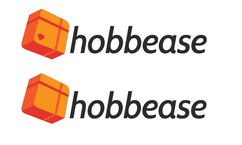
Hello, everyone! Round 2.
Thanks again, your comments were extremely helpful. We've moved away from Frutiger in hopes of a typeface with some more personality.
We're attempting to go in a different direction. This new symbol clearly says, package, and enjoyment but I'm not too sure it says hobbies.
Thanks for your help!



4 Comments
I think this is definitely taking a better direction. The symbol is more communicative and I think it has a broader appeal. I wouldn't use the heart at all unless your target demo is women. I actually kind of miss having some way of visually separating the syllables of "hobb" and "ease." To me it helps in describing the brand.
We feel a lot more confident about this. We like the balance the heart provides to the composition. Changing the colour of the heart to the medium orange lessens its impact, so I think we'll go with that unless we find a better symbol/representation.
We agree with your point about the syllables and we lightened the grey of 'ease'. We'll upload and so you the changes after we get some more feedback.
Thanks!
That's a pretty good improvement since the first version. You did a good thing by letting go of the heart.
Now the execution isn't quiet good yet, though this font works. This symbol has a kinda run of the mill aspect to it, as you obviously used the 3d effect in Illustrator.
Keep the parcel idea, but try to come up with something of your own instead of relying on this type of effects. Sketch a lot of idea, you can definitely find something pretty cool.
Also, not a fan of the colors. Too hot and fiery.
Good luck!
Thanks! The 3D aspect was done by hand, but I completely understand what you mean. It looks a little 'stock' or something.
The only issue with this font is that its a Google Font and been drawn really poorly...
Thanks for the helpful input!