HUMA CATAMA
martin_mre | Tue, 12/08/2015 - 23:11
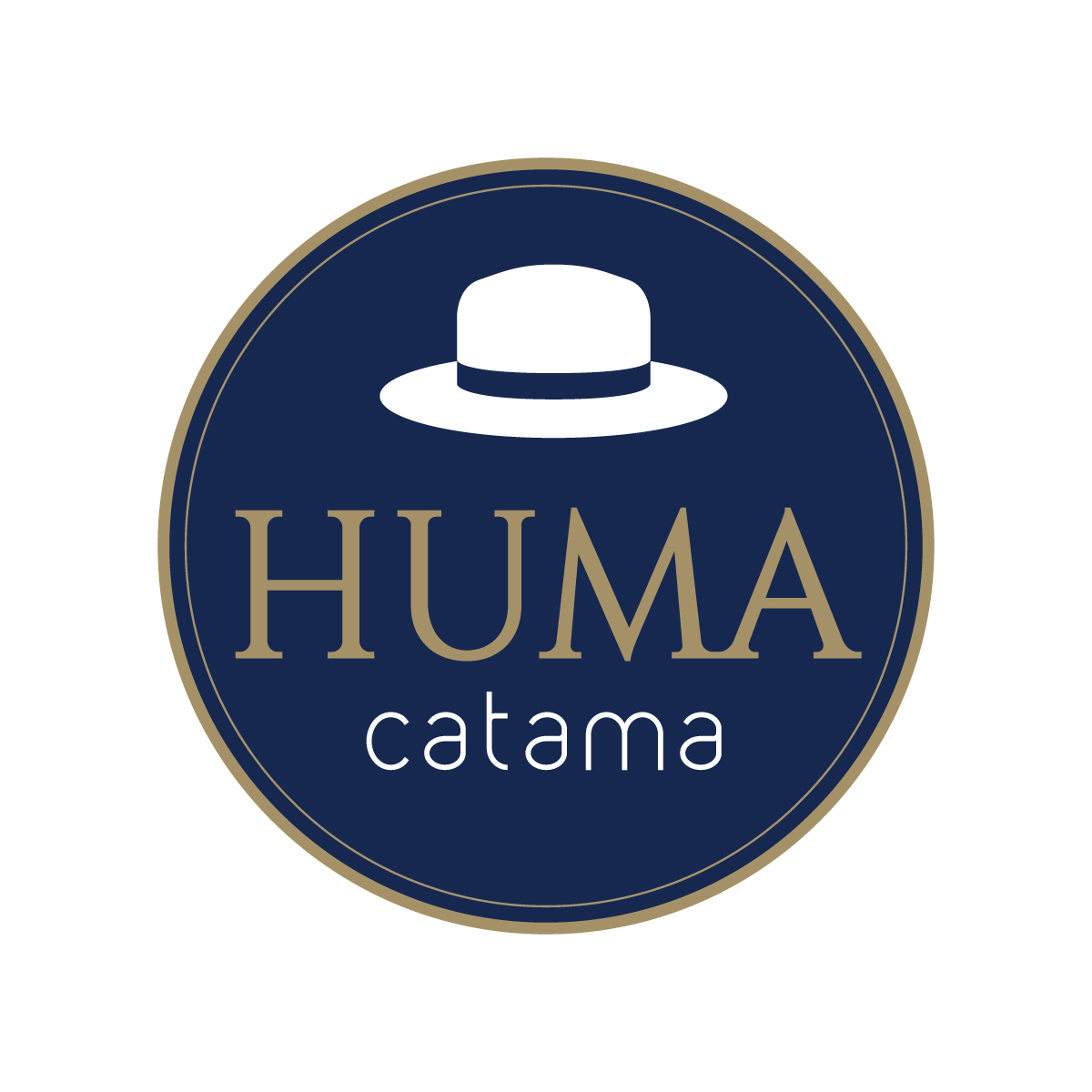
Brief from client
Brand for a hat company - HUMA, means covered and CATAMA, head
I really miss the "desde 1920" haha i think it gives a complement, anyway y made another hat icon. thanks for your support.
4 Comments
I like both of the last logos. I think it really just depends now on how fancy the hats are that they sell!
:)
I think this is the best of them. But watch your centering. The hat is a little too far to the right, and "catama" is a little too far left.
Also, I'd be interested to see the colors inverted, just to compare. Try the hat and "catama" in gold, and "HUMA" in white. I think the name ought to stand out a little more, this might help.
I'm not entirely sure about the font selection, these two don't seem to complement each other very well. They're not bad, but I think they could be better.
The hat itself is nicely done, unfortunately it's not distinctive, if we remove all words, nobody can tell it's your brand. And I know this is pretty challenging to think out of the box.
When browsing through, found the following logo having the hat hanging on letter H can be interesting. This can be tweak into a logo by itself. Of course not to copy, just throwing idea. Good luck.
http://www.brandsoftheworld.com/critique/holly-oak-enterprises-llc
Ceepie is exactly right. Your hat does look like a hat, but it's not enough. You got to give it some character, make it unique to your brand.
Here's a few examples of logos with hats from Pinterest: http://tinyurl.com/z5953q3
A bit of research and inspiration (and sketching!) can go a long way =)