Brands of the World is the largest free library of downloadable vector logos, and a logo critique community. Search and download vector logos in AI, EPS, PDF, SVG, and CDR formats. If you have a logo that is not yet present in the library, we urge you to upload it. Thank you for your participation.


11 Comments
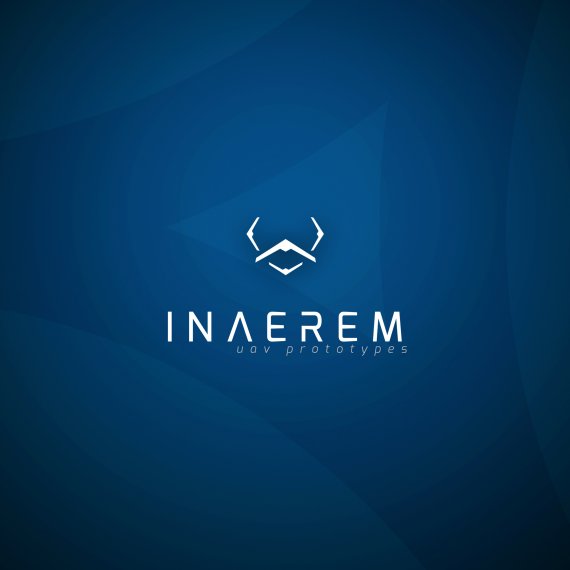
i like it. the symbol is perfect in my opinion, i can read uav right from it. The font should be kerned a little at n and a (may be just perceptual but this is how i feel). Good job
good work! but i agree with hueroth, you should kern a & n, and align right horizontal lines.
This looks neat overall, but I'm really not digging that symbol. Looks a face with a big mustache to me =) It needs to be simplified. I would keep the "mustache" and remove the other thingies.
Nice choice of font, though as pointed out, the kerning needs some fixing. The subtext should be centered and given a bit more space from the word mark.
Love it, great job!
actually i think it would be better if you centered all the text and the symbol ,its a bit odd having the symbol and main text centered with the sub text aligned to the right. Also leave a little more space between the Main text and Sub text
I see a clock in a symbol, sorry. Love a color scheme and a typography on a main text, but not so much in a sub one... Like a symbol on a background for some reason. I think if you would make a thick " U " then place a plane next to it to resemble " A " and then flip that plane down to resemble " V " - that might be the answer? Good luck.
As a creative for a defence contractor that shall not be named, i think it's bang on (pun intended). Of course the guys I work for would want an American flag in there somehow, but don't think i'd change a thing.
Both the word "uav" in lowercase and the font are a bit hard to read and confusing; maybe "drone concepts" would be better (unless this wording is what the client insists on), or capitalize UAV. Otherwise, it's a great design.
I think the symbol is obviously superfluous. It looks like a clock with hands drooping.
I like your symbol's idea - that it plays between a plane and a mans face. The type has a little bit of work needed on it. The fact that the "E"'s turn in a little bit is distracting. I would find a different simpler typeface.Other than that, its on the way to being great! :)
Sooo fine!!!!!