Brands of the World is the largest free library of downloadable vector logos, and a logo critique community. Search and download vector logos in AI, EPS, PDF, SVG, and CDR formats. If you have a logo that is not yet present in the library, we urge you to upload it. Thank you for your participation.
iomaio
godoval | Sun, 08/11/2013 - 19:37
Brief from client
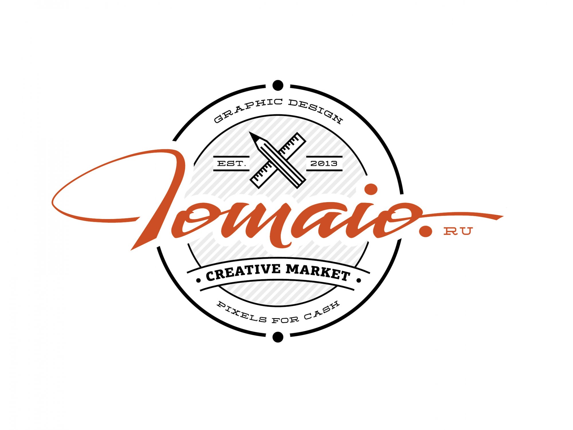
Lettering for my new domain. I wonder what the word "iomaio" in different languages, or what the association calls.
You got me! Whe I saw the thumbnail, I thought it was other yet another awesome logo from Joe Fuckin' White. But no, it's an awesome logo from you!
This is really looking good. All the elements work pretty well together.
Now my only beef is the way the capitalized i looks like. It's better than the first version but I'm not really sure the reading really flows as well as it could.
I'm also not sure about how the .ru thing looks like.
Ok, that's two beefs, but they're pretty small =)
Overall, this is a really cool, professional looking logo. A job well done, sir.
Maybe I misunderstood something, but Joe did not "Faking". Joe is very talented, hardworking and cool designer. =)
I'll draw the letter "I". I'll post later. I'm trying to - until it turns out.
.ru may not be at all there.
I really like your good advice, Charlie. Thank you!
PS And what does "beef"? Google translate talking about meat. I do not understand =)
I thought it was JW as well haha. This looks great. Everything works very well together.
I still have a problem with the I. I still don't read it as Iomaio. I didn't even notice the .ru until shawali pointed it out, and that might be something else to tweak. Overall looks great!
I suspect that with the "I" that is not so. It affects my uncertain knowledge in latin writing. The letter "I" has been very difficult for me =) I have to be honest, it took away. I'll try again. Thanx.
Great work and you have your own unique style to this common style.
I try to produce a badge variation aswell as a nice logo on its own.
Also, Try taking away all of the line work for a nicely laid out typographic style logo.
The only thing, I think you need to work on is the initial Iomaio, I often use fonts for hand written looks, but I also work with pen and paper to find unique ways to link letters or to create nice swashes. (attached, Second image)
Other than that, I love it, great job, good use of colours and shading too!
Its the current trend to work with badge logo's, there nice and clear for anyone who wants to know what your doing, but its good to have the badge as an option, That way you can avoid playing into the trend too much (Been a little guilty of that myself)
Thank you, Joe! In about to remove all the lines - really interesting turns. I did not know that this can be =). Later I post it, what happened. Much needed advice!
With a capital letter "I" does not work yet. But I'm trying =) It turns out "J", "S", "l"
I like hipster trend =)
PS What does "aswell."? Google fcking translate does not know =(
And a little idea on how to develop hand written text. Try to find unique ligatures or connections between letters. What I'm seeing people do a lot a the moment is to connect capital letters to the letter i's dot. Have a look on a pinterest and you'll find lots of examples of this. Will be fun and well worth the experimenting on these little areas now that you've got a nice layout for your logo, just a few little focused tweaks to finish it all off.
I to thought it was a JW job! this looks really nice and clean, i totally agree with all the comments above, just try to improve the Iomaio.ru part a bit more.
11 Comments
You got me! Whe I saw the thumbnail, I thought it was other yet another awesome logo from Joe Fuckin' White. But no, it's an awesome logo from you!
This is really looking good. All the elements work pretty well together.
Now my only beef is the way the capitalized i looks like. It's better than the first version but I'm not really sure the reading really flows as well as it could.
I'm also not sure about how the .ru thing looks like.
Ok, that's two beefs, but they're pretty small =)
Overall, this is a really cool, professional looking logo. A job well done, sir.
Maybe I misunderstood something, but Joe did not "Faking". Joe is very talented, hardworking and cool designer. =)
I'll draw the letter "I". I'll post later. I'm trying to - until it turns out.
.ru may not be at all there.
I really like your good advice, Charlie. Thank you!
PS And what does "beef"? Google translate talking about meat. I do not understand =)
When I say Joe Fuckin White is just to underline the fact that he is just an awesome designer. Nothing derogatory here =)
And "having a beef" means to have a problem with something or someone.
I thought it was JW as well haha. This looks great. Everything works very well together.
I still have a problem with the I. I still don't read it as Iomaio. I didn't even notice the .ru until shawali pointed it out, and that might be something else to tweak. Overall looks great!
I suspect that with the "I" that is not so. It affects my uncertain knowledge in latin writing. The letter "I" has been very difficult for me =) I have to be honest, it took away. I'll try again. Thanx.
Great work and you have your own unique style to this common style.
I try to produce a badge variation aswell as a nice logo on its own.
Also, Try taking away all of the line work for a nicely laid out typographic style logo.
The only thing, I think you need to work on is the initial Iomaio, I often use fonts for hand written looks, but I also work with pen and paper to find unique ways to link letters or to create nice swashes. (attached, Second image)
Other than that, I love it, great job, good use of colours and shading too!
Its the current trend to work with badge logo's, there nice and clear for anyone who wants to know what your doing, but its good to have the badge as an option, That way you can avoid playing into the trend too much (Been a little guilty of that myself)
Thank you, Joe! In about to remove all the lines - really interesting turns. I did not know that this can be =). Later I post it, what happened. Much needed advice!
With a capital letter "I" does not work yet. But I'm trying =) It turns out "J", "S", "l"
I like hipster trend =)
PS What does "aswell."? Google fcking translate does not know =(
And a little idea on how to develop hand written text. Try to find unique ligatures or connections between letters. What I'm seeing people do a lot a the moment is to connect capital letters to the letter i's dot. Have a look on a pinterest and you'll find lots of examples of this. Will be fun and well worth the experimenting on these little areas now that you've got a nice layout for your logo, just a few little focused tweaks to finish it all off.
I to thought it was a JW job! this looks really nice and clean, i totally agree with all the comments above, just try to improve the Iomaio.ru part a bit more.
Great Job!
Thank you Matt! I'm trying to improve. Post it later.
beautiful work