Kings Ransom Foundation
matth88 | Thu, 01/30/2014 - 18:46
Brief from client
King's Ransom Foundation is Christian non profit that supports many causes: feeding/clothing/educating orphans, rescuing children and women from sex trafficking, building water wells and homes in impoverished communities, feeding the poor, rescuing women from domestic violence, and they create jobs in communities where there are none. 100% of every donation directly to the people in need.
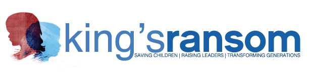
Here I went with the silhouette of children's faces.
Their main focus of the foundation to rescue orphans/saving children from sex trafficking, and giving them a home, a family, an education, food and water, and healthcare.
I made it a little grungy because it looked a little bland without the texture.
3 Comments
I like the ideas in this one the best. I would perhaps add some more space between the silhouettes and the "k". Also, the kerning needs to be adjusted a bit. As it sits, the "s" in "king's" seems to be a part of "ransom". I think it is because of all the space surrounding the apostrophe. The "tagline" needs to be moved down a couple spaces so it isn't so cramped up in the title, and can breathe a little. Good job!
It looks like it says "king sransom" and, while I like the look of the overlapping silhouettes, you're going to run into a real problem trying to reproduce in one two color scenarios. the blues in the main text are also too similar which is part of the aforementioned problem. The subtext is also impossibly small (look at the version preview icon to the right and you can see it turn into a line) and it's crowding your main text.
Get back to paper and take your pencil for a walk. Best of luck to you.
What he said + Kerning on 'king's' needs tightening.