Logo
xoxonynke | Mon, 05/18/2015 - 11:21
Brief from client
This is an assignment for school.
I have to create my own logo.
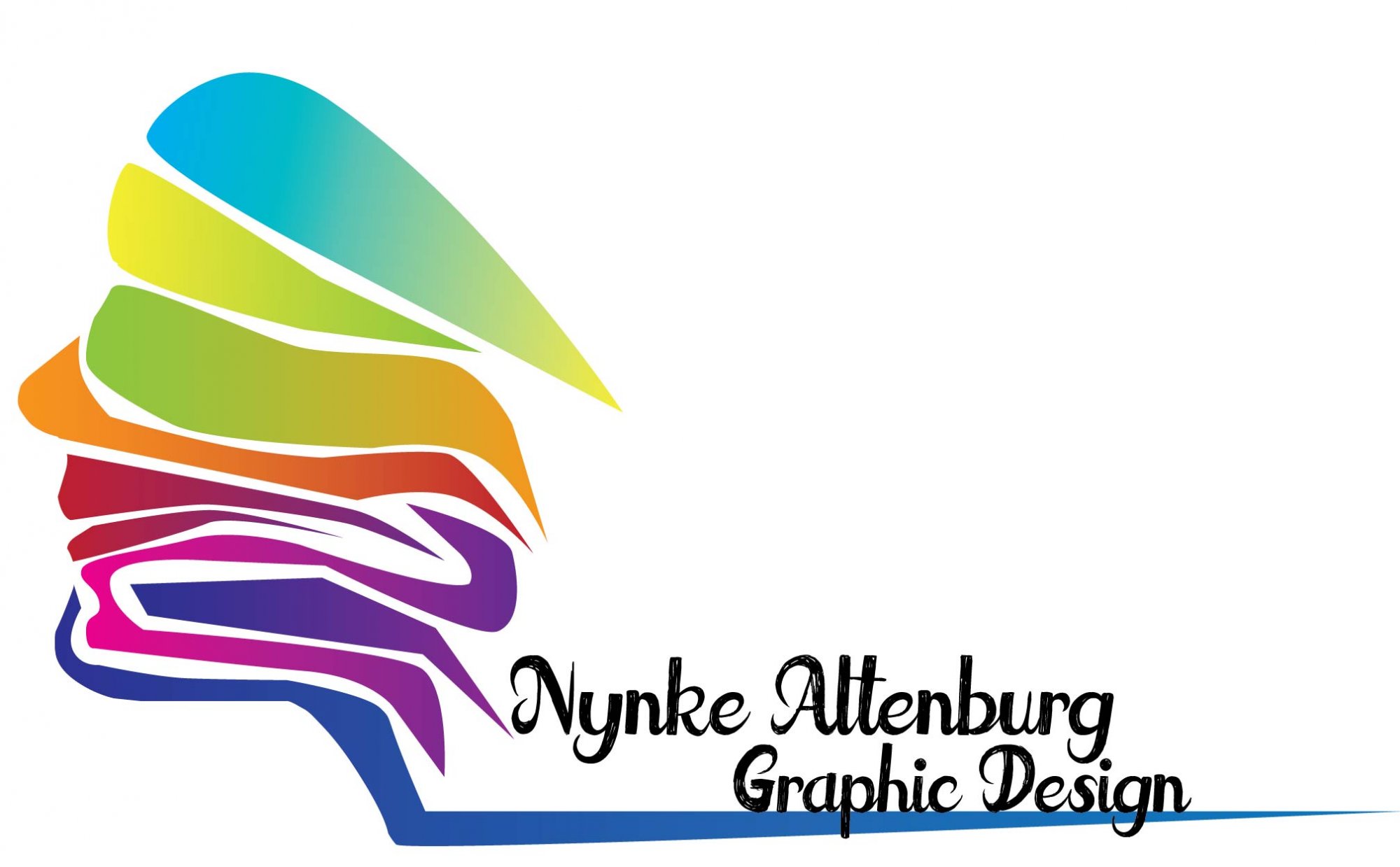
This is the second version, and I have no idea which one is better so please let me know what you think.
 Partnered with Clios.com | Ads of the World
Terms of Use | Privacy Policy | Cookie Policy
© 2021 Clio Awards LLC.
Partnered with Clios.com | Ads of the World
Terms of Use | Privacy Policy | Cookie Policy
© 2021 Clio Awards LLC.


5 Comments
i like the logo, but i don't like the colors.
i like the logo, but i don't like the colors.
Ok good idea for the symbol but it could use some more finetuning its still a bit rough around the edges. I would delete the long "tail" it has for the titel, just make it compact and simpel!
So the symbol can be worked on but the font and the placement of the titel is useless. The font is hard to read (also the proportion is of)
For the colours i would say its too much right now. Of course u can work with gradients but be careful of using to much. U also have to consider that printing gradients is hard.
This is not working for me.
First off, the general composition is a mess. You have that big mass on the left and then the very small and flimsy word mark somewhere down on the mark. It feels so random. Try to work with a grid as much as possible.
Now, what is that symbol supposed to represent? (beyond a face, obviously...) It also looks a bit random to me as well as dated (it kinda looks the old Apple logo from the 80's). Generally, it feels rushed, the curves are clumsily done and messy.
The font screams "bad free type from DaFont!". It just adds to the whole flimsiness of the whole thing. Try to find good professional fonts one sites like www.fontsquirrel.com or www.losttype.com (be careful with this one, though, as their fonts are great but free, hence ubiquitous) Be very careful of DaFont. There are some cool fonts, but lost in an ocean of terrible fantasy fonts that have no place is a professional logo.
Between the two versions you posted, this one is the less bad, for the simple fact that you didn't use strokes (best avoided as a general rule of thumb)
But globally, I'd restart from scratch, with a proper creative process this time: research (look at what great pros do with their own logo), sketching, then sketching, a bit more sketching and when you think you're done, sketch again. When you have something you believe in, use Illustrator to execute the idea the way you intend to and not the way the software lets you. 98% of the time, when a logo is bad, is because one of these steps has been skipped or rushed.
Good luck!
overall not readable, the symbol isn't working (you have curves, the sharp angles, the colors are not working either (also never use gradient)