Brands of the World™ an All Creative World site
Brands of the World is the largest free library of downloadable vector logos, and a logo critique community. Search and download vector logos in AI, EPS, PDF, SVG, and CDR formats. If you have a logo that is not yet present in the library, we urge you to upload it. Thank you for your participation.

Logo John van der Wens

Brief from client 

Working on a logo for myself. I’m a mediadesigner for poetry projects.

At first I was just messing around with the avenir font, the blending options in illustrator and experimenting with readability. Then I found myself working on it as a new logo for myself. Although it still looks like a graphical exercise Im happy with the shape and the concept. Only thing is that I’m having trouble finishing the proces. I tried some hip bright colors, my own colors, outlines, etc. What do you think?
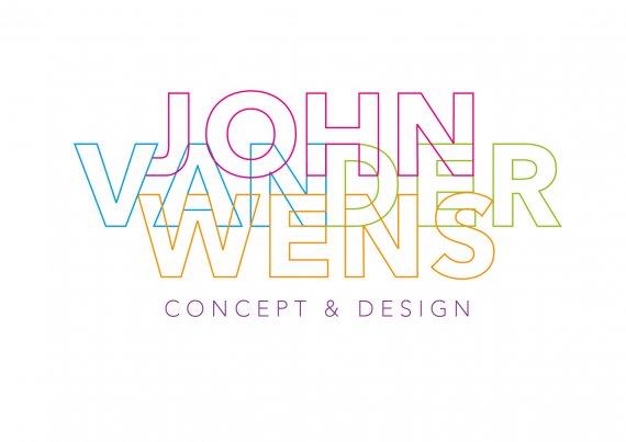
More space. Better readability?

3 Comments

M@'s picture
345 pencils
Idea
updown
Symbol
updown
Typography
updown
Colors
updown

Love it! Definitely remember-able! the colours really help make it "POP" more than the black & white version.

Good Job!

2m4's picture
9 pencils

Thanks man! I also moved the word 'JOHN' up. Together with the colours I think the readability is much better. Still working on the details...

cooperads's picture
195 pencils
Idea
updown
Typography
updown
Colors
updown

I really don't care for this. I think it is too light, too hard to read.

Version history

  • Version 1

    • I No votes yet.
    • S No votes yet.
    • T No votes yet.
    • C No votes yet.
  • Version 2

    • I No votes yet.
    • S No votes yet.
    • T No votes yet.
    • C No votes yet.
  • Version 3

    • I 50%
    • S 66%
    • T 50%
    • C No votes yet.
  • Version 4

    • I No votes yet.
    • S No votes yet.
    • T No votes yet.
    • C No votes yet.
  • Version 5

    • I 50%
    • S 100%
    • T 50%
    • C 50%